When someone opens an email, the very first thing they notice is the header. Before they read a single sentence, their eyes land on the banner at the top. If it looks clean, attractive, and relevant, they keep reading. If it feels cluttered or confusing, many people close the email within seconds.
That is why learning how to design email headers and banners is more important than many marketers realize. A well designed header does more than look nice. It sets the tone, communicates your brand, and encourages the reader to continue scrolling.
The good news is that you do not need to be a professional designer to create effective email headers. With a few simple design principles and the right tools, anyone can create banners that look polished and professional.
Let us walk through how to design email headers and banners that actually get attention and improve engagement.
Why Email Headers Matter More Than You Think?
Most people scan emails quickly. They rarely read every word. According to research from Nielsen Norman Group, users often decide within seconds whether content is worth their time.
Your email header acts like a first impression. It tells readers three important things immediately:
- Who the email is from
- What the email is about
- Why they should keep reading
If the header clearly communicates value, readers are more likely to continue.
Email marketing studies published by HubSpot also show that visual elements can significantly improve click rates when used correctly. A well designed banner can guide attention toward your main message or call to action.
In short, the header is not just decoration. It is part of your marketing strategy.
Key Elements of a Good Email Header
Before jumping into design tools, it helps to understand what makes a good email banner.
A strong header usually includes a few essential elements.
Brand Identity
Your logo or brand name should appear clearly in the header. This builds recognition and trust.
Consistency matters here. If your header style changes drastically in every email, readers may feel disconnected from your brand.
Clear Message
Your header should support the purpose of the email.
For example:
- A sale announcement might include a bold promotional banner.
- A newsletter might have a clean branded header.
- A product launch may highlight the product image.
The goal is clarity. The reader should immediately understand the topic of the email.
Visual Simplicity
Many beginners make the mistake of adding too many elements. Bright colors, multiple images, and several fonts can make the design feel chaotic.
Simple designs usually perform better.
A clean banner with one image and one headline often looks more professional and easier to read.
Mobile Friendly Design
More than half of emails today are opened on phones. If your banner looks great on desktop but breaks on mobile, you lose a large portion of your audience.
Make sure text is large enough and images scale properly.
Email testing platforms like Litmus regularly emphasize mobile optimization as one of the most important factors in email design.
Step by Step Guide to Designing Email Headers and Banners
Now let us go through the actual process.
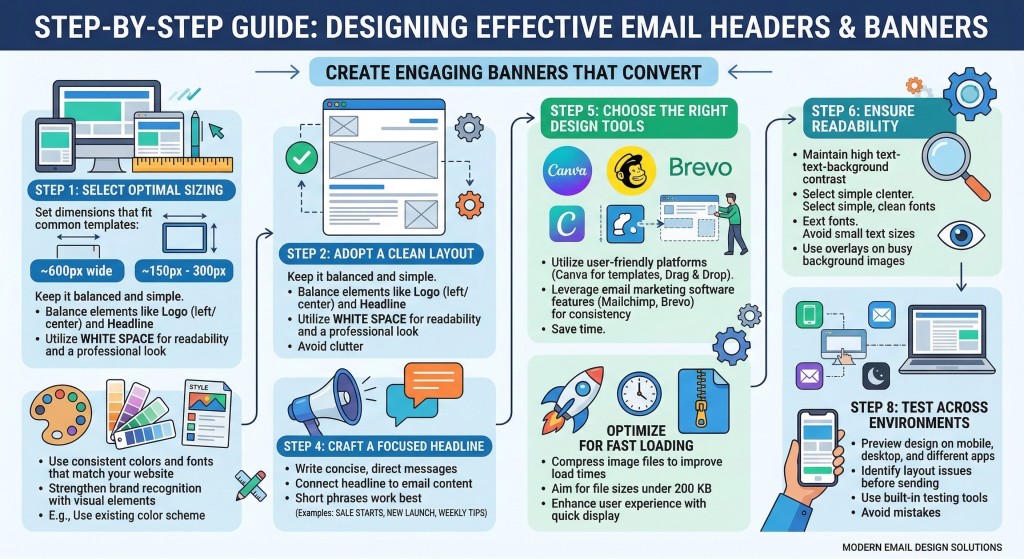
Step 1: Choose the Right Size
The first step is selecting a banner size that works well across email platforms.
A common size used in many email campaigns is:
600 pixels wide
This width works well because most email templates are built around it.
The height can vary depending on the design, but many headers fall between:
- 150 px to 300 px height
This gives enough space for branding and a headline without pushing the main content too far down.
Step 2: Pick a Clean Layout
When designing your banner, keep the layout simple and balanced.
A typical email header layout includes:
- Logo on the left or center
- Headline or message
- Optional background image or color
White space is extremely helpful. It keeps the design readable and professional.
Avoid filling every corner with graphics.
Step 3: Use Colors That Match Your Brand
Your email design should feel like an extension of your website and brand identity.
Use:
- Brand colors
- Consistent typography
- Familiar visual elements
For example, if your website uses blue and white, your email header should follow the same theme.
This helps readers instantly recognize your brand when the email arrives in their inbox.
Step 4: Add a Focused Headline
Your header banner often includes a short headline.
Keep it simple and direct.
Examples:
- “Summer Sale Starts Today”
- “New Product Launch”
- “Your Weekly Marketing Tips”
The headline should connect directly with the content of the email.
Avoid long sentences in banners. Short phrases work best.
Step 5: Design the Banner Using the Right Tool
Design tools make the process much easier, especially for non designers.
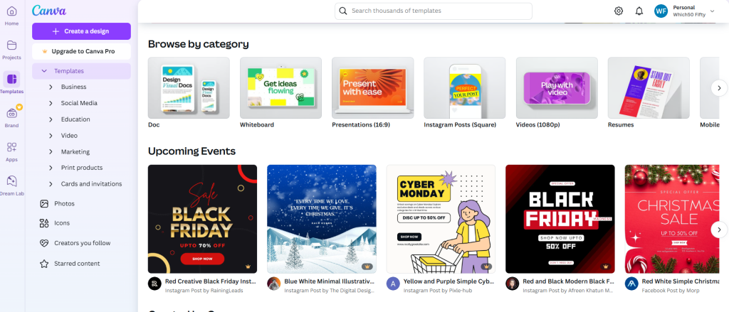
Many marketers create email banners using Canva, which offers ready made templates and drag and drop editing. It allows you to quickly adjust colors, fonts, and images without complicated software.
If your email campaigns are managed inside platforms like Mailchimp, you can also design and test banners directly within the platform. This helps ensure the header fits perfectly with the email layout.

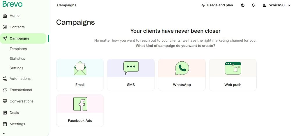
For businesses focused on automated email campaigns, tools like Brevo allow you to combine design, automation, and campaign tracking in one place.
Using the right tool saves time and ensures your headers remain consistent across campaigns.
Step 6: Keep Text Readable
Many banners fail because text is difficult to read.
To avoid this problem:
- Use high contrast between text and background
- Choose simple fonts
- Avoid tiny text sizes
If you place text on top of an image, consider adding a subtle overlay to improve readability.
Remember that readers are scanning quickly. Clear text improves comprehension.
Step 7: Optimize Images for Fast Loading
Large images can slow down email loading time.
If your banner image is too heavy, some email clients may delay or block it.
Before uploading the banner, compress the image while maintaining quality.
A file size under 200 KB usually works well for most email designs.
Fast loading images improve user experience and help keep readers engaged.
Step 8: Test the Header Before Sending
Never send an email campaign without testing the design first.
Check your header in different environments:
- Desktop email clients
- Mobile devices
- Dark mode settings
Testing helps you catch issues like cropped images, broken alignment, or unreadable text.
Many email platforms offer preview tools that simulate different devices and inbox layouts.
Taking a few minutes to test can prevent embarrassing design mistakes.
Common Email Banner Mistakes to Avoid
Even experienced marketers sometimes overlook small details that affect performance.
Here are a few common mistakes.
Too Much Text
- Your banner should introduce the email, not explain everything.
- Long paragraphs inside headers make the design crowded.
Overuse of Stock Images
- Generic stock photos can make your emails feel less authentic.
- Whenever possible, use original images, product visuals, or simple branded graphics.
Ignoring Mobile Design
- If your header text becomes tiny on mobile screens, readers may skip the email entirely.
- Always preview the mobile version before sending campaigns.
Inconsistent Branding
- Changing colors, fonts, and styles in every email weakens brand recognition.
- Consistency builds familiarity and trust with your audience.
Simple Design Ideas That Always Work
If you are unsure where to start, try one of these proven banner styles.
Minimal Logo Header
- A simple logo with a brand colored background.
- Best for newsletters and regular updates.
Promotional Banner
- Large headline with a product image or offer.
- Perfect for sales announcements.
Illustrated Banner
- Custom illustrations or icons that match the theme of the email.
- Works well for educational newsletters or product tutorials.
These simple approaches often perform better than overly complex designs.
Wrap Up
Email headers and banners might seem like a small design element, but they carry a lot of influence. They shape the reader’s first impression, guide attention toward your message, and reinforce your brand identity.
Once you start paying attention to header design, you will notice how much difference it makes. Clean layouts, clear headlines, and consistent branding can turn an average email into something people actually enjoy opening.
The best part is that creating professional looking banners is easier than ever. With a little practice and the right tools, anyone can design email headers that look polished and engaging. And when your emails start grabbing attention right from the top, the rest of your message has a much better chance of being seen.


Leave a Comment