
Let’s be completely honest about what happens after a survey closes. You did the hard part—you carefully wrote the questions, timed the email blast perfectly, and successfully convinced people to actually participate. But now you are staring blindly at a massive, terrifying spreadsheet filled with hundreds of rows of raw data, random text comments, and percentages that don’t immediately form a cohesive picture. What was supposed to be a goldmine of deep customer insight suddenly just feels like an overwhelming math problem.
Figuring out what your audience is actually trying to tell you doesn’t require a background in advanced data science. It just requires a reliable system to filter out the background noise so you can find the narrative hiding in the numbers. Let’s walk through how to break down your raw survey results into practical decisions you can actually act on.
You have to clean up the mess first
Before you try to generate a single pie chart or look at an average score, you need to ruthlessly scrub your raw data. If you leave garbage inputs in your survey pool, your final conclusions will be completely warped.
Go through your spreadsheet and delete the speeders—the people who somehow finished a ten-minute questionnaire in thirty seconds without reading anything. Drop the straight-liners who just clicked the middle “Neutral” option for every single question just to get to the final screen. If you spot a row where someone left a random keyboard smash like “asdfghjkl” in a required text box, delete their entire entry. Data cleaning feels like incredibly tedious janitorial work, but it is the absolute only way to ensure your final report reflects reality instead of internet bots and lazy clickers.
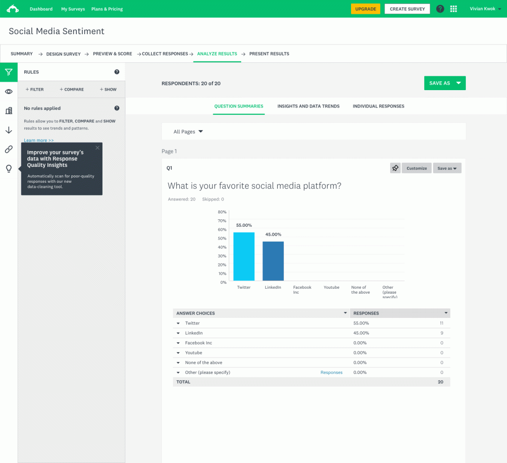
Start with the big, obvious numbers
Once your data pool is clean and trustworthy, tackle the easiest part of the project: the quantitative answers. These are your standard yes/no questions, your one-to-ten rating scales, and your simple multiple-choice options.
Don’t overcomplicate things at this stage. Just look at the broad baseline averages. Did 70% of people rate your new product feature highly? Did the vast majority choose the cheapest pricing option over the premium tier?
Once you establish those overall averages, you can start doing some basic cross-tabulation. This is just a technical term for comparing different audience segments against each other to see where opinions split. Instead of just looking at your overall customer satisfaction score, filter the data to see how brand new users voted compared to people who have been paying you for five years. Those segment splits are almost always where the most surprising, valuable insights are hiding.
Dig into the messy open-ended comments
Your multiple-choice data tells you what happened, but those open text boxes tell you exactly why it happened. Reading through three hundred paragraph-long complaints or suggestions can be mentally exhausting, but you absolutely cannot skip this phase.
Instead of just reading them randomly and relying on your gut feeling, try manually coding them. Read through the first twenty or thirty comments and identify a few recurring themes—like “confusing pricing,” “annoying login screen,” or “super fast shipping.” Then, go through the rest of the comments and simply tally up how many times those specific topics pop up. What initially looked like a giant, overwhelming wall of messy text slowly turns into a measurable, chartable metric you can actually present to a team.
Let the right platform do the heavy lifting
You really shouldn’t be doing all of this intense manual calculation in a raw Excel file anyway. Modern platforms are designed to handle the most painful parts of the analysis for you, instantly turning raw user inputs into visual dashboards.
If you are running a massive, company-wide market research initiative and need incredibly deep, complex analytical filtering, SurveyMonkey remains the heavyweight standard for crunching those large datasets. On the other flip of the coin, if you just need to launch quick customer satisfaction polls and want an interface that practically builds the visual reports for you without a learning curve, ProProfs Survey is incredibly fast and user-friendly. Meanwhile, if your ultimate goal is to analyze user behavior right as it happens—like triggering a quick feedback box while someone is actively browsing your website or using your mobile app—Survicate is brilliant at capturing and charting that real-time contextual data.


Turn the data into a human story
Absolutely nobody wants to open their email to find a thirty-page PDF filled with dense, raw data tables. When it is time to report your findings to your team or your boss, your primary job is to act as a translator, not a human calculator.
Pick the three most important insights from the entire project. Use simple, clean bar charts to show the visual evidence, and then explain what those numbers actually mean for the business in plain English. Don’t just stand there and say, “Forty percent of our users dislike the checkout process.” Tell them a story: “Nearly half of our users are abandoning their carts because the checkout page forces them to create an account, which means we need to build a guest checkout option by next quarter.”
Analyzing a survey is simply about connecting the dots. Clean out the junk entries, look for the big demographic trends, read the actual words your customers took the time to write, and let your software handle the heavy visual lifting. When you present it, just tell your team what is broken, why people care, and how to fix it. That is all a great survey report really is.


Leave a Comment