Writing a survey looks simple. You think of some questions, drop them into a form builder, email the link, and wait. But if you’ve ever looked at a spreadsheet of answers only to find skipped sections, single-word replies, or totally useless data, you know it’s not that easy.
A good survey gives you clear direction. A bad one just wastes everyone’s time and gives you messy data. The difference always comes down to how you phrase your questions and how painless the form is to fill out. Let’s walk through what it takes to make your surveys work.
Why the Design of Your Form Matters
A lot of people focus on what they want to ask but forget about how they’re asking it. That’s a massive mistake. When you draft questions without thinking about the user’s focus, completion rates fall. Your survey’s design sets the tone for the entire interaction:
- Company reputation: A clean, fast form shows that you respect your customers. A buggy, layout-breaking questionnaire makes your brand look sloppy.
- Data clarity: Planning the layout ahead of time guarantees that your final spreadsheet holds useful answers, saving you from deciphering confusing data.
If your questions are long, repetitive, or confusing, people will close the page or select random boxes just to get to the end.
Studies on user surveys show that shorter, clean forms get way better engagement. When you respect people’s time, they’ll give you actual, thoughtful answers instead of rushing through to get it over with.
Start with One Main Objective
The fastest way to ruin a survey is to start drafting questions before you decide what you are actually trying to solve. Without a clear target, you’ll end up asking about ten different things, leaving your readers confused.
Before you build anything, ask yourself:
- What is the exact problem I’m trying to fix with this feedback?
- Who is the right audience to answer this particular set of questions?
- What will I actually change or build once I get their feedback in my database?
When you have these answers, the writing part is easy because you can filter out anything that doesn’t directly serve your main goal.
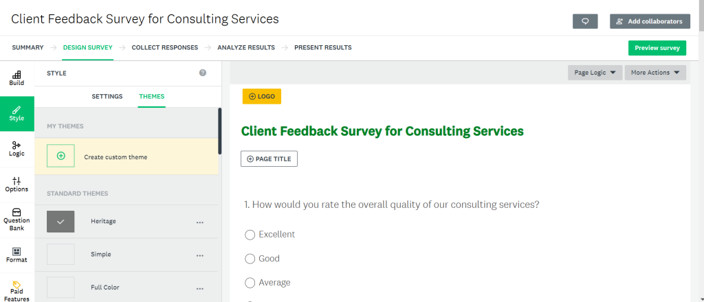
For example, if you’re using a tool like SurveyMonkey to check on customer satisfaction, keep the questions focused on their recent buying experience. Stick to your core questions so respondents don’t get tired and close the window.rest becomes easier.
Keeping your goal focused helps you avoid unnecessary questions and keeps the survey clean.
Picking the Right Formats for Your Questions
Different question layouts serve different jobs. You want a layout that keeps things simple for the reader but still pulls the right insights:
- Ranking Lists: These ask users to order items by preference. They help you find customer priorities, but they can be annoying to fill out on mobile, so use them sparingly.
- Multiple Choice Fields: Classic radio buttons or checkboxes. Use these when the options are clear and you want to measure raw percentages for a slide deck.
- Free-Response Boxes: Give users a blank text area to write down details. They are perfect for catching unexpected errors, but they require effort. Keep these to a minimum so users don’t abandon the page.
- Rating Scales: Ask users to score an experience, usually from one to ten. These are excellent for tracking customer satisfaction week by week.
- Yes/No Prompts: Quick binary choices. They don’t provide much detail but are perfect for directing users down specific pathways.
Best practices for writing effective survey questions
Writing a survey isn’t about looking smart. It’s about getting clean answers.
- Keep it conversational: Avoid big corporate words, acronyms, or dry industry jargon. If a reader has to read a question twice, rewrite it. Use short, simple sentences.
- Write neutral prompts: Never lead your audience. Avoid phrasing like, “How helpful was our customer care team?” Instead, go with, “Please rate your call with our support agent.”
- Stick to single-focus questions: Avoid combining unrelated queries. Asking, “How would you rate our software’s dashboard layout and load times?” is tough to answer if the design is great but it takes ten seconds to load. Make those two separate questions.
- Create a natural flow: Open with quick, easy-to-answer prompts to get people started. Place your detailed questions in the middle, and save contact information for the final page.
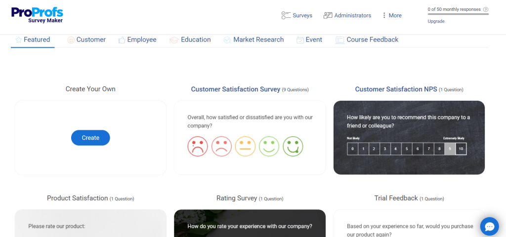
Specialized services like ProProfs Survey make this structure simple. They support conditional routing, meaning if a user answers “No” to a question, the platform automatically skips the next few steps and keeps them moving.
Common mistakes that affect survey results
Even tiny mistakes can ruin your survey results:
- Skipping the test run: Always send a draft to a few colleagues before sending it to clients. You’ll catch broken link paths, spelling mistakes, and confusing questions.
- Making every field required: If people feel forced to write paragraphs, they will close the survey.
- Overlapping choices: Make sure range options don’t collide. If your age brackets are ’20-30′ and ’30-40′, where does a 30-year-old click?
- Forgetting about phones: Most people open surveys on their mobile screens. If your layout requires zooming or horizontal scrolling, they’ll leave.
How tools can improve your survey design
Using the right tool makes a big difference. It helps you design better surveys and manage responses easily.
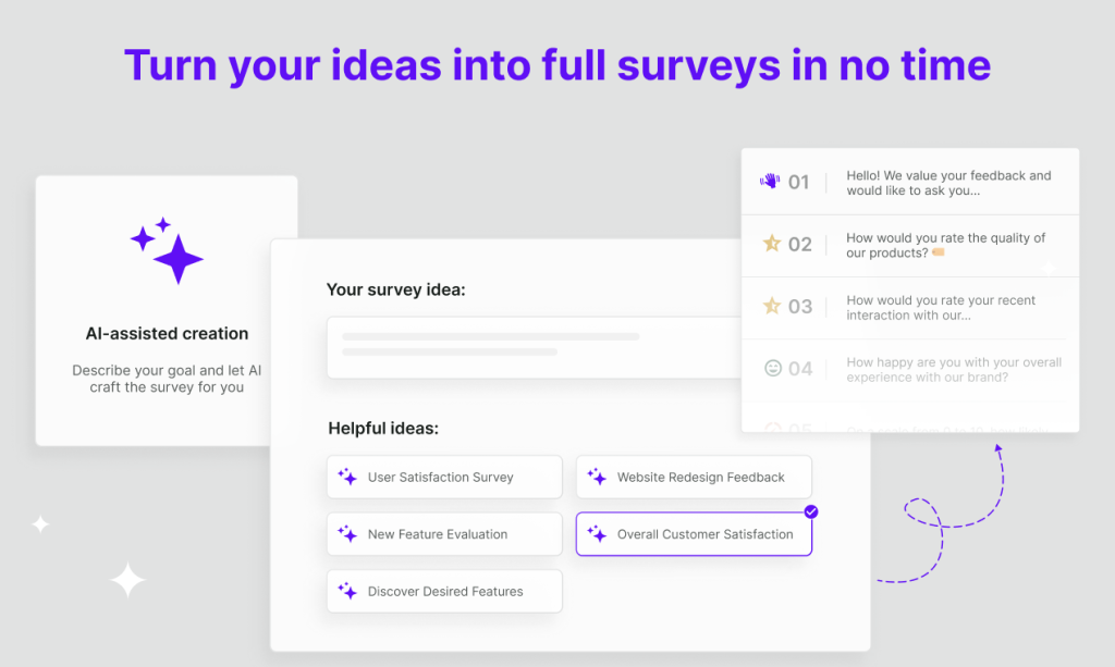
For example, platforms like Survicate allow you to create targeted surveys and collect feedback directly from users based on their behavior. This makes your data more relevant and useful.
External factors that influence survey success
A good design helps, but timing and audience matter just as much. Send your survey when your audience is active, and be honest about why you’re asking. Often, just adding a short note explaining how you will use their feedback to fix real product bugs is all it takes to get responses. Respondents want to know their voice matters, not that they are just numbers in a spreadsheet.
Wrap Up
A great survey should feel like a brief, easy chat. Write in plain English, make sure the pages load fast on mobile screens, keep your phrasing neutral, and stay focused on a single topic. If you respect your readers’ time, they will give you the clean, honest data you need to make smart business moves.



Leave a Comment