Response rate is one of those metrics that looks simple on the surface — you sent surveys, some people responded, you divide one by the other — but carries significant implications for how much you can actually trust what your data is telling you. A survey that achieves a 12% response rate and a survey that achieves a 52% response rate don’t just reflect different levels of engagement. They potentially tell different stories about your customers, your employees, or your product, depending on who responded and who didn’t.
Understanding what response rates to expect — and what drives them above or below benchmark — is foundational to designing surveys that produce actionable, representative data rather than data that merely confirms the opinions of your most vocal respondents.
Why Response Rate Benchmarks Vary So Much
The single most important variable in survey response rates is the relationship between the sender and the recipient. That relationship determines how much obligation, interest, or familiarity the recipient feels when the survey arrives — and those emotional factors drive response behavior more reliably than survey length, design, or incentive structure.
A customer who just completed a support ticket interaction and receives an immediate satisfaction survey is primed to respond. The issue is still top of mind, whatever emotion they felt during the interaction hasn’t faded yet, and the request actually makes sense in the moment. Compare that to the same customer receiving a broad quarterly relationship survey with no direct connection to a recent interaction. The response dynamics are completely different, even though both surveys are measuring customer experience.
This is why response rate benchmarks must be understood by survey type, not as a single universal number. Aggregated “average” response rate figures — which often appear in the 30% to 40% range in generic research summaries — mask enormous variance that makes them nearly useless for planning purposes.
Benchmarks by Survey Type
Customer Satisfaction Surveys (CSAT) Post-transaction and post-interaction CSAT surveys, particularly those delivered immediately after a customer service interaction, consistently achieve the highest response rates of any survey category. When deployed via email within 24 hours of a resolved support ticket, benchmarks range from 25% to 50%, with the upper end achievable when the subject line clearly references the specific interaction. In-app micro-surveys (one to two questions presented within the product interface) can reach 60% to 80% in some implementations, largely because the respondent doesn’t need to leave their current context.
The significant caveat: CSAT surveys disproportionately attract responses from customers at emotional extremes — those who had an exceptional experience and those who had a genuinely poor one. Customers who had an adequate, unremarkable experience are the least likely to engage. This response bias is worth factoring into how you interpret average scores, not just how you interpret total response volume.
Net Promoter Score (NPS) Surveys NPS surveys sent to an existing customer base via email typically achieve response rates in the 20% to 40% range for relationship NPS (periodic brand-level surveys) and slightly higher for transactional NPS deployed immediately after a purchase or key interaction. B2B organizations with strong customer relationships and frequent touchpoints often see NPS response rates at the higher end of this range. B2C organizations with large, lower-engagement customer bases typically land lower.
Survey fatigue is a real compounding issue for NPS programs. Organizations that deploy NPS quarterly or more frequently without visible follow-through on the feedback they receive see response rates erode meaningfully over 12 to 18 months. Respondents stop engaging when the loop never closes.
Employee Engagement Surveys Annual engagement surveys run through HR platforms typically achieve response rates of 65% to 85% in organizations where leadership actively champions participation and employees trust that results will inform action. The word “trust” matters here. In organizations with a history of collecting employee feedback without visible follow-through, response rates can fall to 40% to 55% even when participation is strongly encouraged.
Pulse surveys — shorter, more frequent check-ins deployed weekly or monthly — achieve slightly different results. Early in a pulse program, novelty drives response rates upward, often to 70% to 85%. Over time, without clear evidence that the feedback influences decisions, rates settle between 50% and 65%. The organizations that maintain high pulse survey response over years are almost universally the ones where findings are shared transparently and actions are communicated back to employees.
Market Research and Consumer Surveys This is where expectations need to be calibrated most carefully. Cold or panel-based market research surveys — where recipients have no prior relationship with the organization — routinely achieve response rates of 5% to 20%, with the lower end more typical for longer surveys sent to general consumer panels. Incentivized panel surveys can improve these rates, but introduce their own representativeness concerns as the responding population begins to skew toward habitual survey takers.
B2B market research surveys face particular challenges. Decision-makers at target companies receive an enormous volume of outreach and have limited discretionary time. Response rates of 10% to 20% are considered respectable for cold B2B research; anything above 25% typically reflects either a strong existing relationship, a highly relevant topic to the recipient’s current priorities, or meaningful incentive.
Website and In-App Feedback Surveys Exit intent surveys, page-level micro-surveys, and in-app feedback widgets operate on fundamentally different dynamics than email-distributed surveys. Response rates for exit intent popups typically fall between 2% and 8%, which sounds low until you consider that a high-traffic site might generate thousands of responses from that small percentage. On the other hand, micro-prompts triggered right when someone wraps up a key workflow, exports a file, or hits an in-app milestone see far higher engagement, regularly capturing 15% to 35% response rates.
The design principle that matters most for in-app surveys is timing and relevance. A survey that appears immediately after a user completes their first successful report export is contextually grounded in a real experience. A survey that appears on random page load is not. That distinction produces dramatically different response rates on identical survey instruments.
What Drives Response Rates Higher
Several factors consistently improve response rates across survey types, and the effect sizes are meaningful enough to warrant systematic attention.
Personalization beyond merge fields. Surveys that reference a specific recent interaction, a specific product the respondent uses, or a specific event they attended outperform generic surveys with a personalized name in the salutation. Genuine contextual relevance — not just superficial personalization — is what moves response behavior.
Mobile optimization. A significant and growing share of survey responses happen on mobile devices, particularly for consumer and employee audiences. Surveys that are poorly formatted on mobile — requiring horizontal scrolling, displaying tiny radio buttons, or loading slowly — see response rates that are meaningfully lower than their desktop equivalents. Mobile-first design is now table stakes.
Length calibration. The data is consistent here: surveys that take under three minutes to complete outperform longer equivalents by a wide margin. That generally means ten questions or fewer for most survey types. Every additional question beyond that threshold produces measurable dropout, and dropout rates compound — a survey with a 20% dropout at question 8 and another 15% at question 12 is producing a significantly biased final sample.
Closed-loop communication. Telling respondents what happened as a result of the feedback they gave in a previous survey is one of the highest-leverage actions an organization can take for sustained response rates. It costs almost nothing to include a short “here’s what we changed based on what you told us” section in your next survey invitation. And the effect on future participation rates is substantial.
Tools That Help You Track and Improve Response Rates
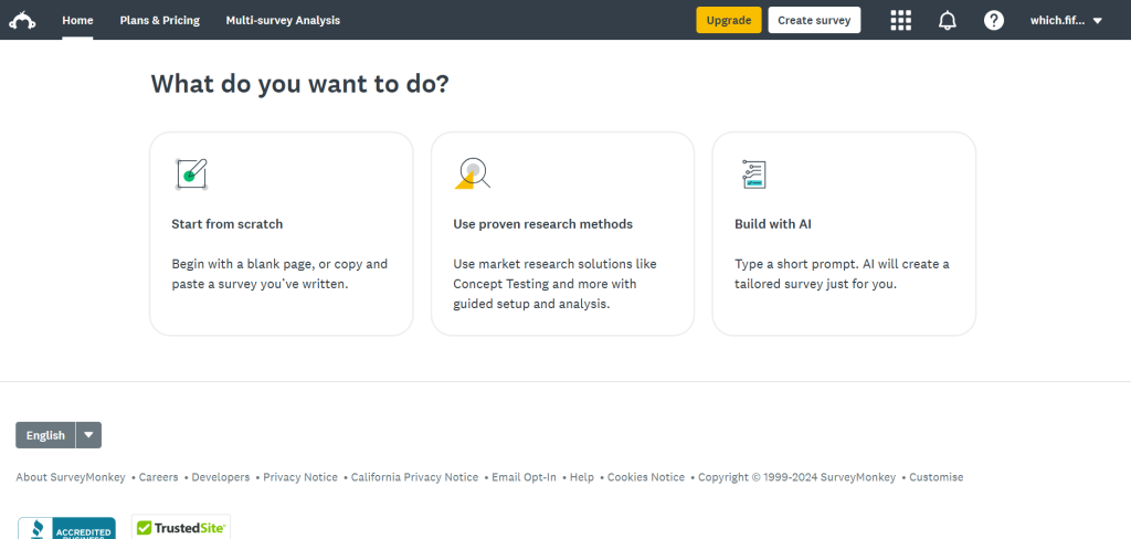
SurveyMonkey provides response rate tracking at the individual survey level alongside benchmark data drawn from its platform-wide dataset, which gives organizations context for interpreting their own numbers. The platform’s survey builder includes built-in guidance on question count and estimated completion time, both of which directly affect response rates. For teams running regular customer or employee surveys without dedicated research infrastructure, SurveyMonkey’s combination of accessibility and comparative benchmarking is genuinely useful.
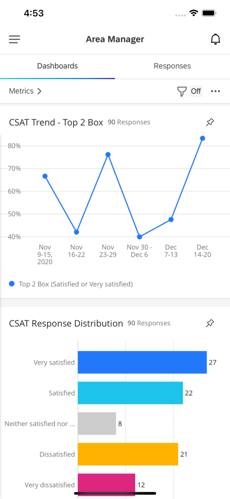
Qualtrics operates at the enterprise end of the market, and its response rate optimization capabilities reflect that positioning. The platform’s ExpertReview feature analyzes survey design before distribution and flags questions likely to cause confusion or dropout. Distribution analytics segment response rates by channel, device, time of send, and demographic group — which enables response optimization based on observed behavior rather than assumptions. For organizations running NPS programs, employee engagement surveys, and market research under one roof, Qualtrics’s cross-program benchmarking is hard to match.
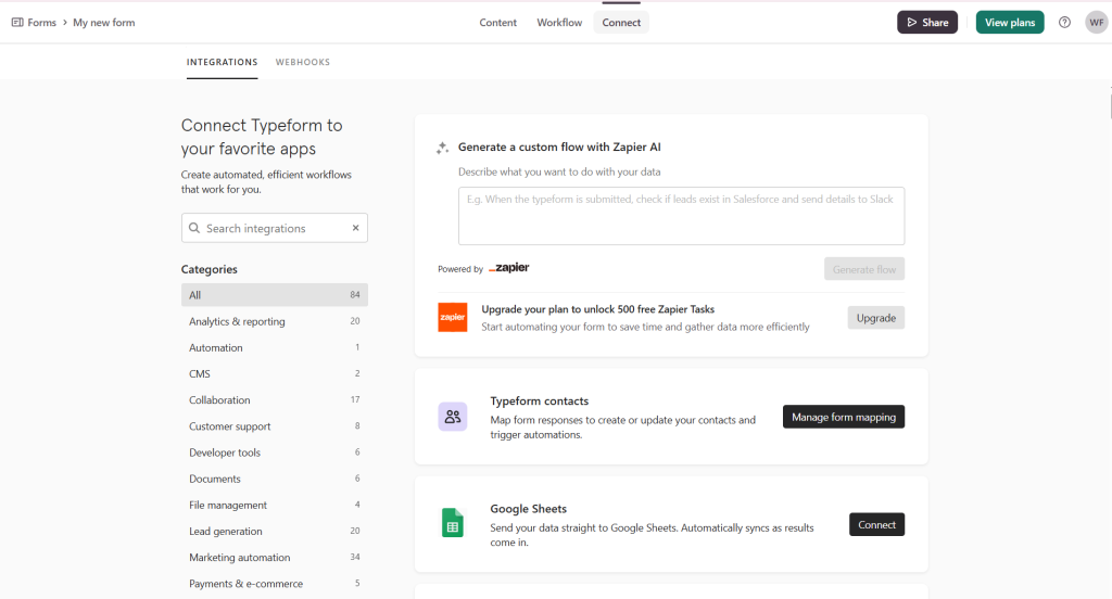
Typeform takes a fundamentally different approach to response rate improvement by redesigning the survey experience itself. By serving up one question at a time in a card-like interface, it feels more like a light back-and-forth than an intimidating government tax form. That single design choice cuts down on page fatigue and keeps respondents moving forward, especially on multi-step questionnaires. According to SurveyMonkey’s Global Benchmark Report, completion rates for surveys that feel conversational and relevant are significantly higher than for surveys that feel like forms. For B2C customer research and brand feedback programs where the survey experience itself sends a signal about how the organization values respondent time, Typeform’s format choices have measurable downstream effects on both completion rates and sentiment.
Alchemer provides advanced survey logic and distribution capabilities that enable the kind of precise targeting that drives response rate improvement at scale. The platform’s ability to trigger surveys based on CRM data, customer behavior events, and support interactions means surveys can be deployed at the moment of maximum relevance — which is consistently the single most powerful driver of response rates across survey types. For mid-market and enterprise organizations that need survey deployment to integrate with existing data infrastructure, Alchemer’s flexibility in connecting to external systems enables a level of contextual precision that generic survey platforms can’t match.

What Low Response Rates Actually Tell You
A response rate below benchmark isn’t just a distribution problem. It’s information. Consistently low response rates typically signal one or more underlying issues: the survey arrives at the wrong moment in the customer journey, the topic doesn’t feel relevant to the recipient, previous feedback has visibly gone nowhere, or the survey itself is too long or poorly designed to justify the respondent’s time.
The instinct when response rates are low is to add incentives or increase the number of distribution attempts. Both can produce short-term improvements, but neither addresses the underlying cause. According to Qualtrics’ XM Institute research on experience management, organizations with sustained high response rates across survey programs share a common characteristic: respondents believe their feedback has consequences. Where that belief exists, people engage. Where it doesn’t, no design or distribution optimization reliably compensates.
Conclusion
Response rate benchmarks give you a reference point, not a verdict. A 22% response rate on a cold market research survey represents strong performance. The same rate on an employee engagement survey in an organization that has been running the program for five years is a meaningful warning signal. Context — survey type, audience relationship, program maturity, and follow-through track record — determines what your numbers actually mean.
The organizations that achieve and sustain response rates at the top of their benchmark range consistently do one thing differently: they treat their surveys as the beginning of a conversation rather than a data extraction exercise. That posture changes how surveys are designed, how they’re distributed, and critically, what happens after the data comes in.



Leave a Comment