I once watched a brand spend four months redesigning their entire product page layout. New fonts, new hero images, repositioned “Add to Cart” button, the works. They launched it on a Monday and sat around refreshing their analytics dashboard waiting for the sales spike.
Conversion rate went down by 0.3 percent.
The problem had nothing to do with design. Their shipping costs were hidden until the final checkout step, and 68 percent of cart abandonments happened at the exact moment the total price jumped. A single line of text showing estimated shipping on the product page would have fixed it in twenty minutes.
That story captures the biggest misconception about conversion rate optimization. Most store owners think CRO means overhauling pages, running fancy A/B tests, or installing new tools. In reality, the highest-impact changes are almost always small friction removals that you’d never spot without looking at real user behavior data.
Here’s what actually works — and where tools like Hotjar, Optimizely, Shopify, and BigCommerce fit into a practical CRO workflow.
Start With the Leak, Not the Landing Page
Everyone wants to “optimize the homepage.” But your homepage might not even be the problem.
Pull up your analytics funnel and look at where sessions actually die. For most stores, the biggest drop-off happens in one of three places: product page to cart, cart to checkout, or checkout to payment confirmation. Each of those gaps points to a completely different issue.
If people browse products but never add anything to cart, the product page isn’t persuading them. That might mean weak images, unclear sizing information, missing social proof, or a price that feels unjustified without context. Writing product copy that sells the outcome instead of listing features makes a measurable difference here. If your descriptions need work, this guide on how to add product descriptions that convert breaks down the structure that consistently performs well.
If visitors add items to cart but abandon before checkout, you’re probably dealing with surprise costs — unexpected shipping fees, taxes that appear too late, or a checkout flow that demands account creation before showing the total. Baymard Institute research puts the average cart abandonment rate at just under 70 percent, and “extra costs too high” remains the number one reason people bail.
If customers reach the payment page but don’t complete the order, trust signals are usually the weak link. Missing security badges, unfamiliar payment processors, or a lack of clear return policies create just enough doubt to kill the sale at the last second.
How to Use Heatmaps and Session Recordings
Guessing why people leave is a waste of time when you can just watch them.
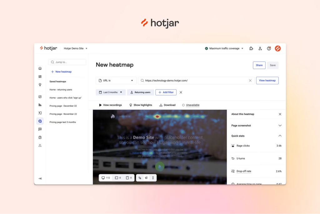
Tools like Hotjar and Mouseflow record actual visitor sessions and generate heatmaps showing where people click, scroll, and stop. I’ve seen stores discover that 40 percent of mobile users never scrolled past the first product image because the page loaded with a massive banner pushing everything below the fold. No amount of A/B testing on button colors would have caught that.
Scroll depth maps tell you how far down a page visitors actually read. If your product description starts below the fold and your scroll depth map shows that 60 percent of visitors never reach it, moving key information higher is a guaranteed improvement.
Click heatmaps reveal what people tap on that isn’t actually clickable — a frequent problem with product images that look like they should zoom but don’t, or visual elements styled like buttons that lead nowhere.
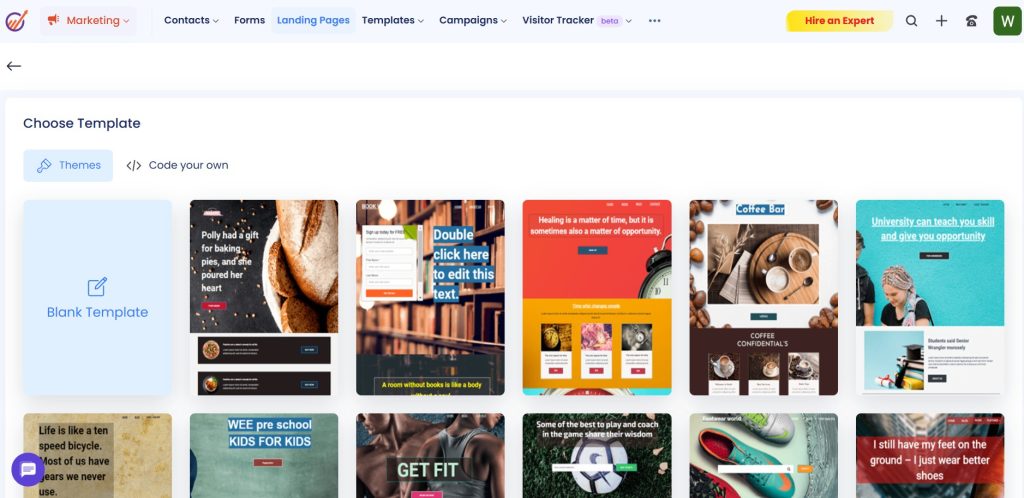
Pair behavior data with your CRM to understand which traffic sources produce buyers versus browsers. Platforms like EngageBay let you tag contacts by acquisition channel and track their journey from first visit through repeat purchase.
Testing Changes Without Burning Your Traffic
Here’s where people get A/B testing wrong: they test too many things at once, run tests for three days, declare a winner, and roll it out permanently.
Good CRO testing requires patience and discipline. Change one element at a time. Let the test run until it reaches statistical significance — usually at least two weeks of normal traffic, sometimes longer for smaller stores. And test things that actually matter to purchase decisions, not superficial tweaks.
Here are the tests that actually tend to move revenue:
- Above-the-fold product layout: Try cramming price, star rating, and the buy button into the first screen. Some stores see a 10 percent lift just by eliminating the need to scroll before clicking “Add to Cart.”
- One-page vs. multi-step checkout: Neither is universally better. A single page works for simple orders. Multi-step flows with progress bars work when you need to collect shipping preferences, gift wrap options, or custom details.
- Social proof near the button: “324 people bought this in the last week” hits differently when it’s sitting right next to the purchase button instead of buried below three paragraphs of product specs.
- Urgency cues: “Only 2 left” works on impulse categories like fashion. For higher-ticket or considered items, it can feel manipulative and actually slow down the sale.
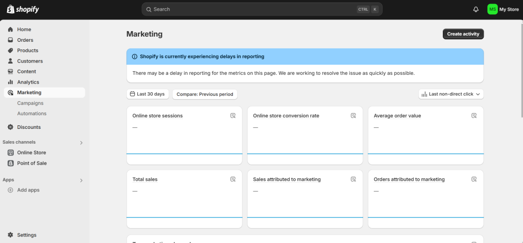
Optimizely and VWO both run server-side and visual tests without dragging in a developer for every experiment. On Shopify, you can run many of these through native theme settings and the built-in reports tab.
The Mobile Checkout Problem Nobody Talks About
Desktop conversion rates for eCommerce typically sit between 3 and 4 percent. Mobile? Roughly half that.
The gap isn’t because mobile shoppers are less interested. It’s because most mobile checkout flows are painful. Tiny form fields, autocomplete that doesn’t work, payment forms that reload the page, and shipping address entry that takes two minutes on a phone screen. Every extra tap is a chance for the buyer to get distracted, switch apps, or just give up.
If you sell on WooCommerce or BigCommerce, test your own checkout on a phone. Actually go through it. Time yourself. If it takes more than 90 seconds from cart to order confirmation, you’re leaving money on the table.
Adding Apple Pay, Google Pay, or a buy-now-pay-later option shaves the checkout down to a couple of taps. Seriously — one client added Shop Pay and their mobile conversion rate jumped by a full percentage point in the first month. If you want to offer split payments or deferred billing, here’s a guide on how to create payment plans for customers that walks through the mechanics.
Wrap Up
CRO doesn’t end at the “Thank You” page. What happens after a first purchase determines whether that customer ever comes back.
Set up a simple three-email post-purchase flow: a thank-you with a small discount code for next time, a review request four days later, and a “you might also like” product recommendation a week after that. Run it once, forget about it, let it print money. Klaviyo and Omnisend both make these automations dead simple for online stores.
And don’t ignore the support side. When a buyer messages you about a shipping delay or a return, how fast you reply decides whether you get a five-star review or a one-star complaint. Speed matters more than perfect answers. If your team needs help staying on top of tickets, this guide on how to monitor support ticket response times breaks it down.
Forget chasing a magic conversion rate number. Find the specific point where your customers hesitate, remove that friction, measure the result, and repeat. That cycle, run consistently, is worth more than any redesign.


Leave a Comment