You can have the best photo, the cleanest design, and a great caption, but if your image is the wrong size, it can still look awkward. Faces get cut off. Text gets chopped. Important details end up hidden behind buttons. And honestly, it makes your brand look messy even if your content is good.
Resizing images for different social platforms is one of those small skills that creates a big payoff. It helps your posts look sharp, professional, and easy to read on every screen.
This guide is a simple, practical walkthrough. You will learn the best image sizes for popular platforms, how to resize quickly without ruining quality, and how to avoid the most common mistakes. It is written for real people who are busy and just want things to work.
Why Social Platforms Crop Images Differently
Every platform has its own layout and goals.
- Instagram focuses on full-screen mobile browsing, so vertical images do well.
- LinkedIn is more feed-based and professional, so wide link previews show up a lot.
- Pinterest is built around tall pins.
- YouTube relies heavily on thumbnails.
That is why one image cannot look perfect everywhere unless you resize and crop it intentionally. Social networks also display posts differently depending on device type. Something that looks fine on desktop might be cropped on mobile.
One more thing: some platforms compress files heavily. So resizing is not only about dimensions. It is also about keeping quality high when the platform compresses your image.
The Quick Rule: Think in Aspect Ratios First
Before memorizing every number, learn this. Most resizing problems are not about pixels. They are about aspect ratio.
Aspect ratio is the shape of your image.
Here are the most common ones you will use:
- 1:1 (Square): Great for profile grids and simple posts.
- 4:5 (Portrait): Perfect for Instagram feed because it takes more space on screen.
- 9:16 (Vertical full-screen): Stories, Reels, Shorts.
- 16:9 (Wide): YouTube thumbnails, landscape content.
- 1.91:1 (Wide link preview): Facebook and LinkedIn style link images.
If you design with the right ratio first, resizing becomes simple. If you start with the wrong ratio, you will end up cropping important parts or stretching things.
Recommended Image Sizes by Platform (2026)
Below are the most useful sizes to keep on a cheat sheet. These are practical, common formats that work well and are widely recommended.
Instagram Image Sizes
Instagram is mainly mobile, so vertical formats work best.
Use these sizes:
- Feed Square Post: 1080 × 1080
- Feed Portrait Post (best reach in feed): 1080 × 1350
- Feed Landscape Post: 1080 × 566
- Story: 1080 × 1920
- Reels Cover / Reels Size: 1080 × 1920
Tip: Even if you upload a full Reels cover, parts can get cropped in the grid view, so keep key text centered.
Facebook Image Sizes
Facebook still supports many formats, but the feed and link images matter most.
Common sizes:
- Profile Picture: 180 × 180
- Cover Photo: 851 × 315
- Feed Post Image: 1200 × 630
- Story: 1080 × 1920
- Event Image: 1920 × 1005
If you want one safe size for Facebook posts, 1200 × 630 is a solid choice.
X (Twitter) Image Sizes
X crops in different ways across devices, so safe placement is important.
Use:
- Profile Picture: 400 × 400
- Header: 1500 × 500
- In-stream Post Image: 1600 × 900
Avoid putting text too close to the edges. Cropping happens often depending on the screen.
LinkedIn Image Sizes
LinkedIn is great for brand content and thought leadership, but it is picky about previews.
Use:
- Personal Profile Photo: 400 × 400
- Personal Cover: 1584 × 396
- Company Logo: 300 × 300
- Company Cover: 1128 × 191
- Link Preview Image / Post Image: 1200 × 627
If you share links often, 1200 × 627 will save you from blurry previews.
YouTube Image Sizes
YouTube is a video platform, but images matter a lot, especially thumbnails and banners.
Use:
- Thumbnail: 1280 × 720
- Banner: 2048 × 1152
- Shorts Cover / Shorts Size: 1080 × 1920
Thumbnails are a big deal. If you do nothing else, make sure your thumbnail is clean, readable, and correctly sized.
Pinterest Image Sizes
Pinterest loves tall images.
Use:
- Standard Pin: 1000 × 1500 (2:3 ratio)
If your pins are too wide or too short, they can get less attention. Tall and clean usually wins.
How to Resize Images Without Losing Quality
Resizing is easy. Resizing well is the part people mess up.
Here is the simple approach that works almost every time.
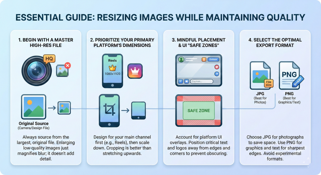
1) Always Start With the Highest-Quality Image
If you start with a small blurry image and try to resize it bigger, it will still look blurry. Upscaling does not create real detail. It just makes the blur bigger.
Best practice:
- Start with the original photo from your camera or phone.
- If you are using a design file, export from the original Canva, Photoshop, or Figma design.
2) Resize for the Platform You Care About Most
Ask yourself: where is this post mainly going?
If this is mostly for Instagram Reels, build it at 1080 × 1920 first. Then resize down for other platforms. It is easier to crop down than to stretch up.
3) Keep Text Inside the “Safe Zone”
This is the biggest mistake with resizing.
Buttons, captions, profile icons, and UI overlays can cover parts of your image. So even if your size is correct, your design can still look wrong.
Simple safe zone tips:
- Keep text away from the top and bottom of Stories and Reels.
- Keep your main subject in the center.
- Avoid placing logos in corners.
4) Export in the Right File Type
Use these general rules:
- JPG: Best for photos. Smaller file size.
- PNG: Best for graphics, text, and logos. Sharper edges.
- WebP: Some tools export this, but not every platform likes it.
If your image has text, PNG often looks cleaner.
The Fastest Ways to Resize Images (3 Methods)
You do not need complicated software unless you want it. Here are three practical methods.
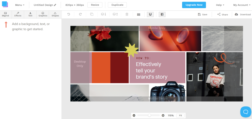
Method 1: Use a Design Tool With Templates
This is the easiest if you post often. You choose a “LinkedIn post” template, drop in your image, and adjust the crop.
Best for:
- Content creators
- Social media managers
- Small business owners
Method 2: Use Built-In Phone Editing (Quick Fix)
If you are in a hurry, you can crop right on your phone.
Best for:
- Simple photo posts
- No text graphics
Not great for:
- Detailed designs
- Branding layouts
Method 3: Batch Resize for Teams
If you manage many images, use a tool like Canva that supports batch resizing. It saves time when you have 20 product photos to adjust.
Best for:
- E-commerce
- Agencies
- Teams posting daily
A Simple Workflow That Saves Hours
If you want a process you can repeat every week, use this one.
- Pick your primary platform.
Example: Instagram. - Design or crop for the primary size first.
Example: 1080 × 1350 for feed, 1080 × 1920 for Story. - Duplicate the design for other platforms.
Keep fonts, colors, and layout consistent. - Adjust crop, then adjust text placement.
This is where most people forget step two. - Export with clear naming.
Example:- product-launch_IG-feed_1080x1350.png
- product-launch_LI_1200x627.png
- product-launch_YT-thumb_1280x720.jpg
- Check each one on mobile before posting.
A quick preview prevents embarrassing crops.
Common Resizing Mistakes (And Easy Fixes)
Mistake 1: Stretching the Image
If you stretch an image to fit a canvas, faces look wide and everything feels off.
Fix:
- Crop instead of stretch.
- Maintain aspect ratio.
Mistake 2: Using Tiny Text
Text that looks fine on a laptop can be unreadable on a phone.
Fix:
- Use fewer words.
- Increase font size.
- Test on mobile.
Mistake 3: Ignoring Platform Crops
Instagram grid crop, LinkedIn preview crop, and Story overlays all behave differently.
Fix:
- Keep important content centered.
- Avoid edge text.
Mistake 4: Reusing One Graphic Everywhere
It seems efficient, but it often looks lazy.
Fix:
- Create a base design.
- Then create platform versions.
Platform-Specific Tips That Make Your Posts Look Better
Instagram Tips
- Use portrait posts when possible because they take more space in the feed.
- Keep text minimal on Reels covers because it can crop in the grid.
LinkedIn Tips
- If sharing links, always preview the link card.
- Keep designs clean. LinkedIn audiences usually respond better to simple visuals.
Facebook Tips
- Bright images do well, but avoid too much text if you are running ads.
- Keep a consistent look for cover and profile images.
X Tips
- Keep key content centered.
- Avoid small text, it often becomes hard to read.
YouTube Tips
- Thumbnails are marketing, not decoration.
- Use big text, clear contrast, and one main idea.
Pinterest Tips
- Use tall pins with a clear headline.
- Bright, clean images stop the scroll.
Conclusion
Resizing images for different social platforms is one of the easiest ways to instantly look more professional online. When your visuals fit perfectly, your content feels intentional. People trust it more. They engage more. And you spend less time fixing last-minute crops.
If you do nothing else, remember this:
- Start with the right aspect ratio.
- Keep important content in the safe zone.
- Export clean files in the right format.
- Create a few reusable templates for your most-used platforms.
Once you build a simple workflow, resizing stops being annoying and starts feeling like a quick finishing step.

Leave a Comment