Let me be honest. Most social media graphics don’t get seen. Not because they are ugly, but because people scroll too fast. You have maybe two seconds to make someone stop. If your design is confusing, boring, or too crowded, they are already gone.
Good social media graphics do two things at the same time. First, they catch attention. Second, they make the message clear quickly. When your post feels clean, easy to read, and looks like it belongs to your brand, people trust it more. And when people trust it, they interact.
This is not a fancy designer guide. This is a real, simple way to create social media graphics that actually work.
Fix your Goal First!
Before you start the design, stop and ask yourself what is the goal? What is the goal of this particular design or a brand? This is where most people mess up. Most of the amateur designers simply open Canva, Photoshop or Figma first, choose a nice template, and then stuff their own content on the premade templates. It should be the other way around.
Always do this, before designing any posts, whether it’s a static post or reels or carousel the golden rules are these, just ask yourself three things.
Ask yourself:
- What is the purpose of this post? Choose the theme or intent of this post, for instance if it’s for black friday sales, make the design accordingly.
- Who is it for? – Same as before, who will check this post, is it for buyers? Or Wholesaler? Or for distributors? Depending on your target audience, your posts need to be curated. For example, if you’re creating a reel about a gaming joystick, your ideal audience is for gamers or teenagers aged 13 to 19. So if your design has the elements that attract the teenage people, your audience and reach will increase exponentially.
- What should they do next? – So finally, the post is seen and users spend their valuable 2 to 8 seconds on your post, what do they need to do next? You need to make them see your product or your account or visit your website to know more about your business, creating that curiosity and need to move to the next step is crucial, adding call to action on your design and including the appropriate link for those CTA’s are important and must needed.
Thus, if you have an answer for all three questions, then your designs become easy. It might look tricky, however if you get used to it you will start creating your designs in a minute of time.
Apart from this, here are some common goals for your designs, these are like a checklist,
- Engagement Posts – If your requirement is engagement alone, like, comments, likes or shares, your post needs a strong hook and very little text. That’s too within that 2 second of your design, that first glance needs to capture the attention.
- Traffic Posts – If your ultimate goal is getting more users to see your website or design, simply saying you want clicks, your design must show a clear benefit and a simple call to action.
- Sales Posts – Just assuming you want sales, then focus on the product, show the proofs that will convince the visitors to buy, and create urgency just by adding CTA in your design to redirect the visitor to your destination (Website).
- Brand Posts – You just want to make your brand familiar among the crowd, your style should look consistent and recognizable. This will make the users stop at your design, and the content will be second call only here.
Thus, once the goal is clear, you stop guessing what to include and what to remove.
Sense Your Brand Look
Whether you’re a small or a big brand, the ultimate goal is your graphic should not just look nice. It should look like you.
Even small brands need some basic rules. Certainly, big brand look is not mandatory to sustain in the market. Just decide a few things that your brand needs to stand out and use them again and again.
- Pick 2 to 4 main colors and one or two neutral colors. This is where your branding starts, so choose them wisely.
- Choose one font for headings and another one for body text. Remember, never go for fancy text styles, ideal, minimalistic and enough to attract the viewers is enough to play around.
- Always think from the viewer perspective and decide when your logo appears and when it does not.
- Once the design layout is fixed, choose a photo style like bright, dark, minimal, or colorful. This will make the viewers stop the scrolling.
- So that’s the successful hook, stay on the theme and use the same shapes, icons, or borders in every design.
Tip: Keep this as a brand guidelines and save this in a note or document. Over time, people will start recognizing your posts even before they read the words.
Resolutions need to be right!
One of the most painful mistakes is designing something beautiful and then seeing it get cropped. It happens all the time.
Use these safe sizes.
- Instagram feed: The ideal resolution for posts is 1080 X 1080 or 1080 X1350px
- Stories and Reels: If it’s video stories then it’s 1080 X 1920px
- Reels cover: Make sure the design in 1080 X 1920px but keep the text in the center
- Facebook and LinkedIn: around 1200 X 628px is enough, if you’re going for higher resolution make multiples of this resolution simply saying twice the actual resolution or thrice. The base resolution number should be this.
Here is the key, always design one main version and then resize for other platforms. Do not just shrink everything. Move the elements so the text stays readable.
Simple Layout Always Wins!
Picking a fancy layout is not an ideal choice. A good layout feels natural, simple but it is planned. A simple structure that works well is this.
- A big hook or headline
- A short supporting line
- One main visual (Possibly your product or theme you’re creating the content for)
- Your brand elements (It’s MUST!)
- A call to action if needed (Works maximum of the time)
If your design feels messy, it usually means you are trying to say too much in one graphic. Limited text gets more attention than a paragraph of content!
Some layouts that perform well are big headlines with small text, photos with text overlay, split design, numbered slides, and before and after. These are the ideal picks!
Limited text influences better readability
People do not read long text on graphics. They scan. Stick to one main idea per design. If you have more to say, turn it into a carousel. This is the motto for all the designs,
- Use large fonts for the main message.
- Keep sentences short.
- Avoid fancy script fonts. ( THIS IS MUST TO FOLLOW!)
- Use strong contrast between text and background. Choosing the background opacity plays a crucial role here.
A good habit is to zoom out and check your design at phone size. If you have to squint, change it. “ALWAYS THINK FROM VIEWER PERSPECTIVE” this should be the first and foremost motto to follow.
Pick Colors That Work (Not Just Colors You Like)
So everything falls in one place, the layout, texts and elements. What about color now? Colors are not just decoration. They affect how readable your post is.
Try this simple formula.
- One main brand color
- One supporting color
- One neutral color
- One highlight color
Remember, text must stand out from the background. If it does not, add a solid box, a gradient, a blur, or a dark filter behind the text. These small changes make a huge difference.
Choose your Image respective to the theme
Your image should support your message, not fight with it. If your design is for Task automation, then the image you’re using needs to be related to that. Even though you pick a right image, there are certain conditions needs to be followed like,
- Use high quality images.
- Avoid busy backgrounds.
- Use the same style across posts.
- Keep lighting consistent for product shots.
You know, posts with faces often get more attention. Educational posts work well with icons or simple illustrations. If your carousels have these aspects, then it will surely make a hit.
Use Icons And Shapes Without Overdoing It
Only images seem boring, Icons and shapes help guide the eye. They can highlight important parts and create structure. Remember to use them to separate sections, highlight text, or create a button look. But do not mix too many styles. One icon style is enough. This will make the design simple and rich.
Design Carousels Like A Story (Not Random Slides)
Whenever your design has many paragraphs and ideas, go for Carousels. Carousels work best when they flow. Carousel also has a formula, the structure needs to follow,
- First slide is the hook. (MUST)
- Second slide explains the problem. (The Theme)
- Next few slides teach or share tips. (Explanation)
- Second last slide recaps. (Give short replay of the content)
- Last slide asks for action. (CTA)
Tip: Keep the layout and spacing consistent across slides. Think of each slide like a short paragraph.
Save Time With Templates
Like we said before, create a layout that works for your brand and make it as a template. If you design from scratch every time, you will get tired fast.
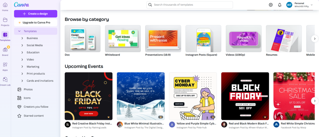
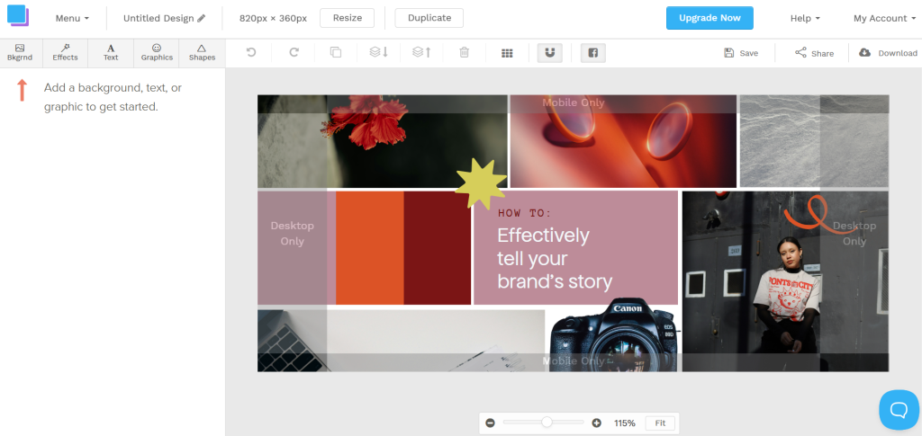
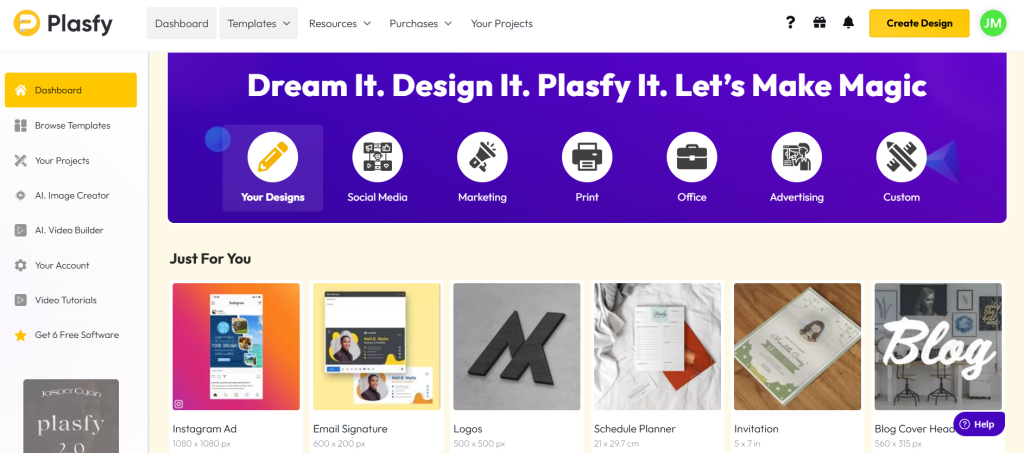
Tools like Canva, Snappa and Plasfy has wide range of template where you can maintain the brand consistency throughout your digital journey.
Simply, Create 5 to 10 templates for common posts like quotes, tips, promos, testimonials, and carousels. Then play around with that, just change the text and images, not the layout.
This keeps your feed consistent and saves time.
Workflow to follow
So this is how the social media graphic designs needs to be done, like we mentioned in carousel part, here we’re summarizing, in otherword replaying the important points mentioned so far, follow this workflow and keep consistency, you will hit the targeted audience soon. Here are the things needs to follow,
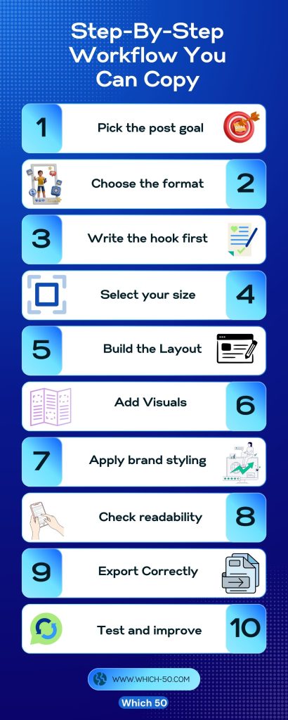
- Pick the goal.
- Choose the format.
- Write the hook first.
- Select the size.
- Build the layout.
- Add visuals.
- Apply your brand style.
- Check on mobile.
- Export.
- Review performance.
This workflow keeps you focused. It also makes your design process faster over time.
Common Mistakes (And Quick Fixes)
Even though you have created a template and designs for your brand, you should be aware of the common errors that needs to be fixed right away, here are the possible error and remedy for the same,
- Too much text. Just turn it into a carousel.
- Weak contrast. Simply add a box or overlay.
- No visual focus. Next move, make the headline bigger.
- Random fonts and colors. Limit them.
- Designing only for desktop. Always preview on the phone.
Conclusion
Thus, reaching the climax now, remember that good social media graphics are not about being artistic. They are about making clear choices so people understand your message fast.
Go for simplicity. Simplicity over complexity is the motto for social media graphics. Use fewer words, cleaner layouts, and consistent colors. No one will ace at first, practice more! Just think of it as a new born baby, you need to groom the content that gets audience attention, once you gain that attention, your designs will start looking professional and easy to trust. So that’s the key point to make the viewers stop scrolling and pushing them to take the action. Simply, play around with the designs, specifically following the syntax and earn more trust and attention.

Leave a Comment