A great logo concept does not start with a cool icon. It starts with a clear understanding of your brand and the people you want to reach. When you get the concept right, designing the final logo becomes way easier because you are not guessing. You are building something that fits.
In this guide, you will learn how to create logo concepts that feel original, look professional, and actually match your brand. This is written for founders, marketers, and designers who want a simple process they can repeat without overthinking it.
What a “Logo Concept” Really Means
A logo concept is the idea behind the logo, not the final artwork.
It is the reason the logo looks the way it looks.
A concept usually includes:
- The message your logo should communicate
- The emotion it should create
- The visual direction that makes sense for your brand
- The meaning behind shapes, icons, and typography choices
Think of the concept as the story. The final logo design is just how you tell it visually.
When people skip concept work, they end up with logos that look fine but feel empty. They might look trendy for a month, but they do not build trust long term. Strong concepts lead to logos that feel simple, memorable, and relevant.
Start With Brand Clarity (Before You Sketch Anything)
This is where most people rush. Do not. Your logo concept needs a solid base.
Before you open any design tool, write down answers to these:
1) What does your brand do in one sentence?
Keep it human, not corporate.
Bad: “We provide scalable solutions.”
Better: “We help small businesses track their finances without stress.”
2) Who is your audience?
Be specific. You are not designing for “everyone.”
Ask:
- Are they new beginners or experienced pros?
- Are they price sensitive or premium buyers?
- Do they want speed, comfort, status, simplicity, or something else?
3) What should your brand feel like?
Pick 3 to 5 words.
Examples:
- Friendly, modern, simple
- Bold, confident, premium
- Playful, creative, youthful
These words will guide your shapes, colors, and font choices.
4) What makes you different?
Write down one clear difference. This is your concept fuel.
Examples:
- “We deliver in 30 minutes.”
- “We are handmade in NYC.”
- “We are designed for non-technical people.”
If you cannot explain your difference clearly, it is worth working on that first. Your logo concept will improve immediately.
Do Quick Research (Without Falling Into the Rabbit Hole)
Research helps you avoid creating a logo that looks like everyone else.
Here is what to research:
Competitors
Look at 10 to 20 competitors and write down patterns:
- What colors do they all use?
- Do they use icons or wordmarks?
- Do they look modern, classic, playful?
Your goal is not to copy. Your goal is to see what is already taken and find space to stand out.
Industry “Visual Language”
Every industry has common visual signals:
- Legal and finance often use serif fonts and calm colors.
- Tech often uses clean shapes and sans-serif typography.
- Kids brands often use bright colors and rounded letters.
You can follow the visual language or break it, but you should do it on purpose, not by accident.
Inspiration, Not Imitation
Build a small inspiration folder. You can use tools like Pinterest, Behance, Dribbble, or even save screenshots into a folder.
Pro tip: Do not collect 200 examples. Collect 20 strong ones. Too many ideas create confusion.
Define Your Logo Concept Direction
Now you turn your brand clarity into design direction.
A simple way to do this is to choose a concept “lane.” Here are a few common lanes that work well.
Concept Lane 1: The Brand Story
Your logo concept connects to your origin, mission, or message.
Example ideas:
- A brand that helps people grow money might use a subtle growth shape.
- A wellness brand may use a symbol that feels calm and balanced.
Concept Lane 2: The Outcome
Focus on the result your customer gets.
Example ideas:
- A scheduling tool might lean into clarity and control.
- A delivery brand might lean into speed and movement.
Concept Lane 3: The Audience Identity
Make your customer feel like the brand is “for people like me.”
Example ideas:
- A brand for creators may feel expressive and bold.
- A brand for corporate teams may feel clean and structured.
Concept Lane 4: The Name Itself
Sometimes the best concept is your brand name done beautifully.
This is where wordmarks shine. A strong typographic logo can be more powerful than an icon, especially for new brands.
A logo concept should be clear enough that you can explain it in one sentence like:
“My logo concept is about clarity and calm, because our product reduces stress.”
Choose the Right Logo Style
Your concept will influence the type of logo you create.
Common logo types:
- Wordmark: Just the brand name in a strong style
- Lettermark: Initials (great for long names)
- Icon or symbol: A standalone mark
- Combination mark: Name + icon together
- Emblem: Badge-style logo, often classic
If you are early-stage and want people to remember your name, a wordmark or combination mark is usually a smart move.
Sketch First (Yes, Even If You Are Not an Artist)
Sketching is the fastest way to explore ideas without getting stuck in details. It also stops you from spending 2 hours picking a font before you even have a concept.
Here is the simple sketch process:
- Set a timer for 15 minutes.
- Make 20 tiny sketches.
- Do not judge. Just generate.
- Circle the best 3 to 5 ideas.
Sketching helps you explore more directions quickly, which is a core part of strong concepting.
If you are not comfortable sketching, try basic shapes:
- Circles can feel friendly and soft.
- Squares can feel stable and structured.
- Sharp angles can feel energetic and bold.
Build 3 Strong Logo Concepts
A common mistake is making endless variations. It feels productive but it slows you down.
Most professionals recommend presenting a small set of strong directions. Too many choices can overwhelm people and lead to confused decisions.
A good target for most brands is:
- 2 to 3 distinct concepts
- Each concept shown in a few variations (like icon-only, wordmark, and combo)
Each concept should be different in idea, not just different in color.
Use Simple Design Principles (So Your Logo Works Everywhere)
This part is huge. A logo is not just for your website. It needs to work on tiny icons, social profiles, and even print.
Here are the key principles to design around:
Keep It Simple
Simple logos are easier to remember and scale. Overly detailed logos fall apart when they are small.
Make It Versatile
A strong logo works:
- In color
- In black and white
- On light backgrounds
- On dark backgrounds
Make It Scalable
Your logo should look good on a billboard and on a favicon. Test small sizes early.
Make It Relevant
Your logo should fit your audience and industry vibe. A playful logo for a serious medical brand may confuse people.
Avoid Trends as the Main Idea
Trends come and go. The concept should be timeless enough that your brand still feels right in five years.
Pick Color and Typography With Intention
Color Basics for Logo Concepts
Color is not decoration. It affects emotion and perception.
A few simple examples:
- Blue often feels trustworthy and professional.
- Red can feel energetic or urgent.
- Black can feel premium and serious.
- Green often connects to growth, nature, or wellness.
Also think about color theory. Certain color combinations feel more balanced and readable, which matters for logos in real life.
Typography Basics
Fonts communicate personality.
For example:
- Sans-serif fonts often feel modern and clean.
- Serif fonts can feel classic and established.
- Script fonts can feel elegant, but they can hurt readability if overused.
When testing typography, always check:
- Can you read it quickly?
- Does it still look good when it is small?
- Does it match the brand words you picked earlier?
Use Tools That Make Concepting Easier
You do not need fancy tools, but the right ones save time.
Here are tools that fit well at different stages:
- Figma: Great for building clean drafts, layouts, and quick variations.
- Adobe Illustrator: Industry standard for vector logo design.
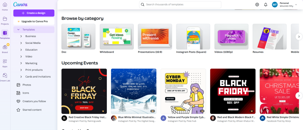
- Canva: Great for quick mockups and early exploration, especially for beginners.
- Procreate: Great for sketching on iPad.
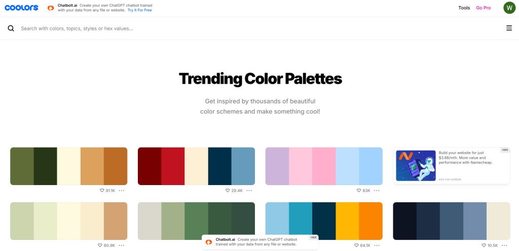
- Coolors: Helpful for building quick color palette ideas.
- Google Fonts: A fast way to test typography directions.

A simple workflow many people use:
Sketch on paper, refine in Figma, finalize in Illustrator, mock up in Canva.
Create Mockups So Concepts Feel Real
A logo concept can look good on a white artboard but fail in real use.
Mockups help you test reality.
Try your top 2 to 3 concepts on:
- A website header
- A social profile image
- A business card
- A t-shirt or packaging label
- A mobile app icon
This step helps you see scale, spacing, and clarity issues early. It also makes feedback easier because people react better to real-world context.
How to Get Feedback Without Getting Confused
Feedback can either sharpen your logo or destroy it. It depends on how you ask.
Ask specific questions like:
- “Which concept feels most like our brand words?”
- “Which logo looks most trustworthy?”
- “Which one would you click on if you saw it in a list of competitors?”
- “What is unclear or hard to read?”
Avoid vague questions like “Which one do you like?” because people choose based on taste, not strategy.
Also, limit feedback to a small group:
- Someone from your target audience
- One internal decision-maker
- One person with a design eye
Too many opinions leads to a messy logo.
Finalize the Concept Into a Logo System
Once one concept wins, you do not just create one logo file. You create a simple logo system.
At minimum, you should finalize:
- Primary logo (full version)
- Secondary logo (stacked or simplified)
- Icon mark (for social and favicons)
- Black version
- White version
- Clear space rules
- Minimum size rules
This keeps your brand consistent everywhere.
Wrap Up
Creating logo concepts is not about finding the prettiest icon. It is about building a visual idea that matches your brand, connects with the right people, and holds up over time.
If you remember one thing, make it this: clarity comes before creativity. When your brand message is clear, your concepts get stronger, faster.
Start small. Define your brand words. Research competitors. Sketch 20 quick ideas. Build 2 to 3 strong concept directions. Test them in real-world mockups. Then refine with feedback that focuses on strategy, not personal taste.
Once you do this a few times, logo concepting stops feeling like guesswork and starts feeling like a repeatable system you can trust.

Leave a Comment