You’re doing everything right. You spent weeks tweaking your website, your content is solid, and the traffic is finally trickling in. But then you look at your analytics dashboard and reality hits: people are showing up, clicking around for a minute, and vanishing into the internet ether forever.
It’s brutal. You don’t just want passive onlookers; you want people who actually want to hear from you.
The harsh truth is that the average website conversion rate hovers somewhere around 2% to 4%. That means out of every 100 people who visit your corner of the web, up to 98 of them leave without dropping their name or email.
So how do you fix it? You don’t do it by slapping twelve aggressive, flashing pop-ups over your text. That just makes people hit the “back” button. Instead, you need to build smooth, logical pathways that make people *want* to hand over their contact info.
What Lead Capture Really Means?
Lead capture is simply the process of turning an anonymous visitor into a contact you can follow up with later.
That usually looks like someone sharing:
- Their name
- Their email
- Sometimes a bit more info, like company or interest
In exchange, you give them something useful:
- A helpful resource
- A free trial
- A demo or call
- A newsletter they actually want to read
Think of it as a fair trade. They give you attention and data. You give them real value.
Step 1: Decide What Kind of Leads You Want
Before you change anything on your site, slow down and answer a simple question: Who do you actually want to hear from?
Get clear on your ideal visitor
Write down a short description of the people you want as leads, for example:
- Marketing manager looking for a better tool
- Founder comparing different services
- Freelancer who wants to learn a skill
When you know who you are talking to, it becomes easier to decide what to offer and what to say.
Pick one main goal per page
Each key page on your site should have one main action you want people to take:
- Product page → Request a demo
- Blog post → Download a related guide
- Home page → Start a free trial or Book a call
If you ask people to do three things at once, they will usually do nothing.
Step 2: Create Lead Magnets People Actually Want
People will not hand over their email just because you ask nicely. You need a clear reason.
A lead magnet is simply something useful you offer in exchange for their details.
Good lead magnet ideas
You do not need something huge. Short and practical often works best. For example:
- Checklists
- “Website launch checklist”
- “Monthly marketing checklist”
- Templates and tools
- Email copy templates
- Budget sheets
- Planning spreadsheets
- Mini guides
- 5 to 10 page how-to PDF
- “Step-by-step playbook” on one narrow topic
- Webinars or short trainings
- A 30 to 35 minute session on one clear problem
- Case studies or reports
- “How we helped X company increase Y result”
Match the magnet to the page
Do not throw the same offer everywhere. Instead:
- On blog posts → offer a content upgrade related to that topic
- On your home page → offer your main lead magnet or free trial
- On pricing pages → offer a demo or consultation call
When the offer matches what they are already reading or thinking about, signups go up.
Step 3: Use Simple, Friendly Forms
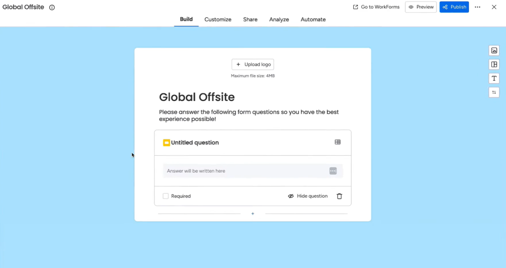
Your form is often the last obstacle before someone becomes a lead. If it looks long or confusing, they leave. Take an example of Monday, a project management tool, they offer free form you can use, customize and add to your website in one go.
Keep your form short
For most early-stage leads, you only need:
- Name
Later, once they trust you more, you can ask for more details.
If you really need extra fields (like company size or role), keep them to just one or two.
Make the form easy to complete
A good form feels quick and safe. Aim for:
- Clear labels (no confusing field names)
- One column instead of two
- A button that says what they get, like:
- Get the checklist
- Send me the guide
- Book my demo
Avoid cold words like Submit. They feel stiff and vague. With one step ahead, you can also use survey apps, for example, QuestionPro. To keep things simple, let’s use QuestionPro as an example.
This app is designed for creating surveys. You can build a set of questions and ask users to fill them out. All responses are saved automatically, and you can review them later. Simple, right? Yet it is highly effective and meaningful.
When you enter the QuestionPro platform and add your survey name to continue, the very next step is to start adding questions, as shown below. It is an easy and intuitive process, and this is exactly how a good lead magnet should work.
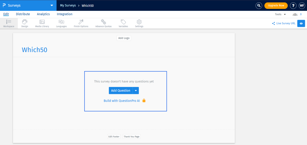
I did not need to explore multiple menus or move through unnecessary steps. I knew what to do in just two clicks. That clarity is what truly matters when building a powerful lead magnet.
Step 4: Place Your Forms Where Intent Is High
You do not need a form in every corner of your site. You need forms in the right places.
Key places to add forms
Here are some strong spots:
- End of blog posts: “Want more help like this? Get the full guide.”
- Within the content: A small box in the middle of an article with a related download
- Sidebars or sticky sections: A short “Get updates and tips in your inbox” form
- Dedicated landing pages: One page, one offer, one form
Use a clear call to action
On each page, make it obvious what the next step is. For example:
- “Ready to see it in action? Book a demo.”
- “Like this content? Get the full playbook in your inbox.”
If people have to guess what to do next, you lose leads.
Step 5: Use Pop Ups Without Annoying Everyone
Pop ups can work well if you use them with respect. The problem is not pop ups themselves. The problem is bad timing and generic messages.
Smarter ways to use pop ups
Try these instead of instant, in-your-face pop ups:
- Exit-intent pop up
- Show an offer when someone moves their mouse to close the tab.
- Example: “Leaving? Want to grab the checklist before you go?”
- Scroll-based pop up
- Trigger it after someone has scrolled 50–70% of a page.
- They already showed interest, so the offer feels natural.
- Time-based pop up
- Appear after 30–60 seconds on page, not in the first second.
Make the offer specific
Avoid bland messages like: “Join our newsletter.” Instead, be clear about what they get:
- “Get weekly website tips in under 5 minutes.”
- “Get the exact template we use for X.”
Step 6: Build Focused Landing Pages
A landing page is a page with one simple goal: get someone to act. No clutter. No distractions.
What a good lead capture page includes
A strong landing page usually has:
- A clear headline
- Says what they get in plain words
- Example: “Free Toolkit: Plan Your Next 90 Days of Marketing”
- Short, scannable body text
- Use bullets instead of long paragraphs
- Focus on benefits, not buzzwords
- Social proof
- A short testimonial
- A few client logos
- A simple result, like “Used by 1,200+ marketers”
- One focused form or button
- No extra navigation or random links pulling them away
Think of this page as your best salesperson, focused on just one offer.
Step 7: Use Chat and Contact Widgets for Warmer Leads
Some visitors will never fill in a form, but they will happily type a short message.
Where chat works best
Live chat or a simple chat-style widget works well on:
- Pricing pages
- Product or service pages
- High-intent blog posts (like “best tools for X”)
You can use chat to:
- Answer quick questions
- Offer to send details by email
- Invite them to book a call
Even a simple “Got questions? Ask us here” box can turn curious visitors into real leads.
Step 8: Make Your Site Feel Safe and Easy
People think twice before typing their email into a site that feels slow or sketchy.
Build trust and reduce friction
Check a few basics:
- Speed
- Pages should load quickly
- Heavy images should be compressed
- Mobile friendly design
- Forms should be easy to tap and type on phones
- Buttons should be large enough and easy to see
- Trust signals
- Show that the site is secure (https)
- Add a short note near the form like: “We respect your privacy. No spam. Unsubscribe anytime.”
Small reassurance lines can make a big difference in signups.
Step 9: Track, Test, and Keep Improving
You do not need to get everything perfect on day one. Lead capture is something you adjust over time.
Simple things to test
Start small. You can test:
- Different button text
- Shorter vs slightly longer forms
- Different headlines on a landing page
- Form placement: top, middle, or bottom of a page
Watch which changes lead to more signups or more demo requests.
Focus on quality, not just volume
More leads is nice, but the real win is more of the right leads. Over time, look at:
- Which pages send leads that actually buy
- Which lead magnets attract serious people vs freebie hunters
Then give more space and attention to what works, and quietly remove what does not.
Wrap Up
Capturing leads from your website is not about tricks. It is about making it easy for the right people to raise their hand.
If you:
- Know who you want as a lead
- Offer something they truly want
- Use short, friendly forms
- Place those forms where interest is highest
- Respect their time and attention
your website starts to feel less like a static brochure and more like a living, working part of your sales process.
Keep it human, keep it simple, and remember: you are not chasing emails, you are starting conversations.


Leave a Comment