Let’s be completely honest: we’ve all sat through a slideshow that felt entirely dead. You’re sitting in a conference room or staring at a Zoom window, looking at a massive wall of text. The presenter is reading word-for-word off the screen in a flat monotone, and your eyes are completely glazing over. It’s pure mental agony. But when people realize their decks are boring, they usually swing way too far in the opposite direction. They panic and turn their presentation into a chaotic, loud mess where text spins, images bounce, and bullet points fly in from random corners of the screen like a bad 90s website.
The secret to a great presentation isn’t avoiding movement entirely—it’s using motion to control exactly where people look and when they look there.
Whether you’re pitching a high-stakes idea to investors, leading a college class, or walking your team through messy quarterly revenue numbers, subtle movement keeps eyes locked on your message. Your brain is hardwired to notice movement; it’s an evolutionary survival mechanism. If something moves on an otherwise static screen, the human eye automatically darts toward it. As a presenter, you can use this instinct to your advantage, or you can abuse it and give your audience massive sensory overload. You just have to make every single shift look completely intentional.
The basic difference you need to know
Before you start clicking around in any software menus, let’s clear up a common mix-up that trips up a lot of people. Presenters often use the words “transitions” and “animations” interchangeably, but they are completely different tools with completely different jobs to do.
- Transitions happen between your slides. This is the visual change—like a smooth fade, a slide lift, or a push—that happens when you move from page 3 to page 4. Think of it like a scene cut in a movie. They exist to bridge the gap and keep the momentum going as you shift from one big, overarching concept to the next.
- Animations happen inside a single slide. This lets you control the exact assets sitting on a live page. For example, you can drop in a critical interface screenshot from the side margin right when you mention it, block off key bullet points until they matter, or let a crucial number show up on its own timeline.
Transitions handle your macro-pacing—how the whole story moves forward. Animations manage your micro-pacing—how people digest the information sitting right in front of them. If you mix up their roles, your deck instantly starts looking chaotic and messy.
Setting up transitions without the headache
The good news is that actually adding a clean transition takes about three clicks total, regardless of whether you are stuck using Microsoft PowerPoint, Apple Keynote, or Google Slides.
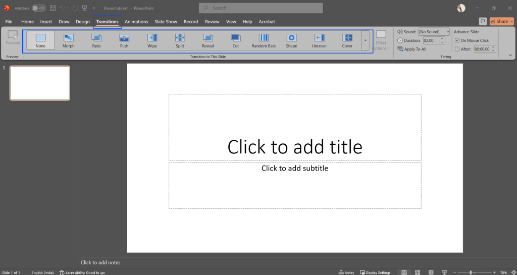
Inside PowerPoint, you just need to click on a slide thumbnail in your left sidebar and open up the dedicated Transitions tab sitting at the top of your screen. You’ll see a row of immediate choices like Fade, Push, and Wipe. Click on any of them to see a quick live preview of how the motion looks. If you want a clean, unified look across the entire deck (which is highly recommended for 95% of business presentations), look over to the far right of that same ribbon and hit the button that says Apply to All. You can also tweak the duration timer right there if the default speed feels a bit too slow or snappy for your speaking pace.
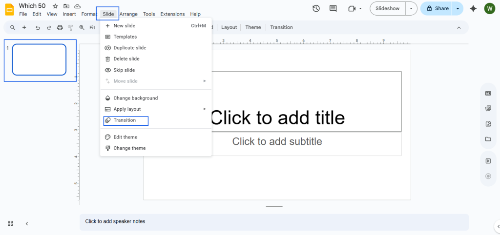
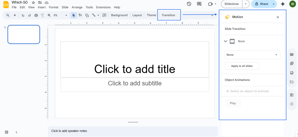
For Google Slides, the basic workflow is practically identical. Right-click your slide thumbnail, hit the Transition option, and a settings sidebar will pop open on the right side of your screen. Pick your style from the dropdown menu, drag the speed slider until the movement feels smooth and natural, and make sure to hit the Apply to all slides button at the bottom of the panel.
If you don’t know what to choose, just stick with a simple Fade. It’s elegant, quick, and never looks tacky or desperate for attention. If you’re walking an audience through a strict chronological timeline or a step-by-step journey across multiple slides, a horizontal Push or Wipe works great because it creates a physical, geographic sense of moving forward through a sequence.
Whatever you do, completely avoid the dramatic zoom-ins, page curls, or origami folds. In any professional or academic setting, loud, complex transitions just look like you’re trying to distract the audience from a complete lack of actual data.
Keep people from reading ahead of you
The single biggest mistake people make when building a slide deck is dropping a page with a massive list of five or six bullet points onto the screen all at once. What happens the second that slide appears? Your audience immediately tunes you out and reads all of those bullet points in total silence. They stop listening to your voice entirely, get the gist of your points in three seconds, and then just sit there waiting for you to finish talking. You’ve completely lost control of the room.
By animating your text elements to appear sequentially, you force everyone to listen to your explanation of Point A before they can even see what Point B is about.
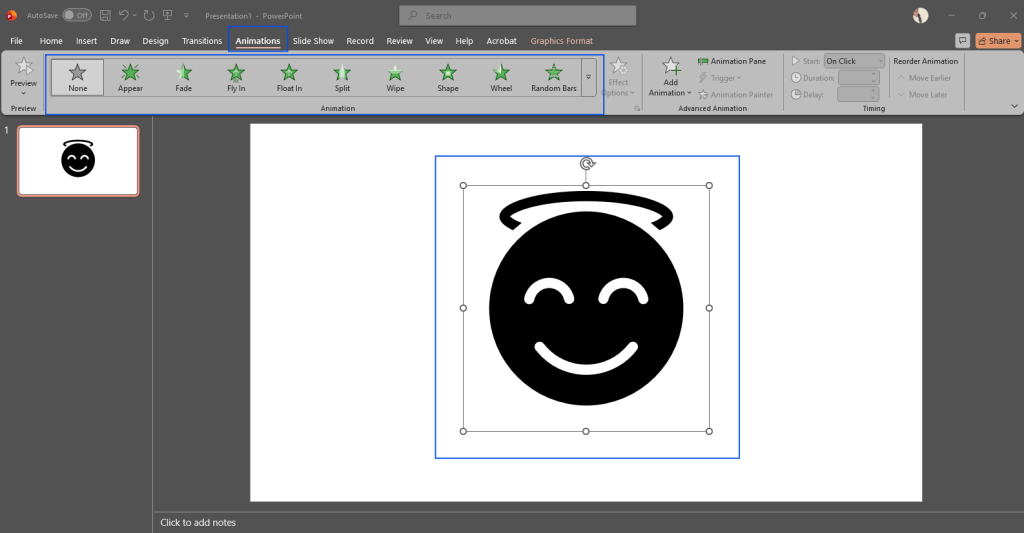
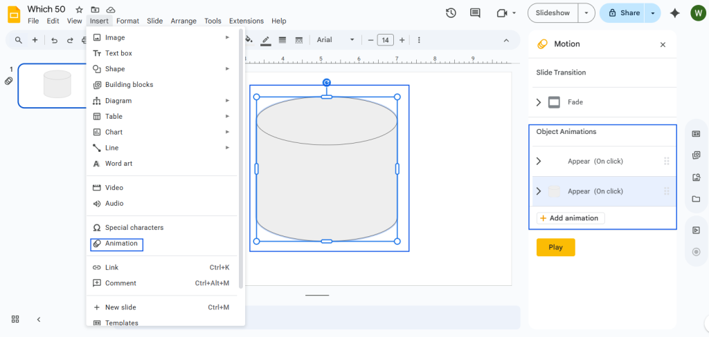
In PowerPoint, you do this by clicking the specific text box you want to control, opening the Animations tab, and selecting Fade or Appear. Then, open up the Animation Pane on the right side. This sidebar is your command center. It lets you drag your elements into a custom order and decide exactly how they trigger. You want to set them to start “On Click” so you control the timing manually with your spacebar or clicker.
In Google Slides, select your text box, go to Insert > Animation, and look at the configuration panel on the right. Make sure to check the box that says By Paragraph. This is the secret toggle that tells the software to reveal your list items one click at a time instead of dropping the entire block on the audience’s head at once.
A few quick rules for clean, human movement
Reveal heavy data gradually. If you have a highly complex bar chart, a financial spreadsheet, or a multi-step workflow diagram, do not show the complete visual right away. It causes immediate visual fatigue. Break that visual data into pieces. Have those specific graph bars or system workflow chunks pop up sequentially while you tell the actual human backstory behind the metrics. It turns a static dump of data into an engaging narrative.
Sync the text changes with your natural voice. Never let the screen beat you to your own punchline. Time your manual clicks so that the visual element materializes on the wall exactly as the corresponding words are leaving your mouth. It makes the entire presentation feel incredibly well-rehearsed, cohesive, and authoritative.
Don’t ignore the built-in software clock. The default animation speed in most modern presentation software can feel incredibly rushed and robotic—often defaulting to a jarring fraction of a second. Try making manual adjustments to your entrance animations, setting your durations closer to 1.0 or 1.2 seconds. A slightly elongated fade feels intentional, premium, and smooth rather than glitchy.
Beware the virtual meeting trap
There is one massive real-world caveat you have to keep in mind if you are presenting remotely over platforms like Zoom, Microsoft Teams, or Google Meet. Virtual meeting software compresses video feeds on the fly, which means high-frame-rate animations often look incredibly choppy, laggy, or completely broken on the viewer’s end.
If your internet connection dips even slightly, that beautiful 1.5-second smooth slide transition you built will turn into a frozen screen followed by an abrupt, ugly skip.
Because of this, if you know you are presenting online rather than on a physical stage, you need to tone down your movement even more. Stick exclusively to the Appear or Fade animations. Avoid anything that requires smooth panning, moving paths, or sliding graphics across the screen, because the streaming software simply won’t keep up, and it will end up looking like your computer is crashing.
Tools that speed things up
If you build a ton of decks for work or clients and find the manual click-and-assign process incredibly tedious, you can look into third-party tools to handle the heavy lifting. For example, extensions like QuickAnimate by SlidesAI allow you to bind your favorite animations to custom keyboard shortcuts inside Google Slides. This cuts down your creation time significantly when you’re dealing with heavy text layouts and repetitive lists.
Additionally, if you are looking into full AI presentation makers to generate initial drafts from text prompts, they often bundle basic transitions into the export file automatically based on the theme you choose. However, even with AI doing the initial layout, you’ll still want to jump into the native settings panels to manually throttle the speeds, delete unnecessary movement, and ensure the overall motion makes sense for your specific speaking pace and environment.
Wrap Up
At the end of the day, animations and transitions should only ever exist as a supporting cast for your presentation. The actual star of the performance is your content, your insights, and your verbal delivery.
If you are using motion just for the sake of having something move, you’re doing it wrong. Start your design process by locking down a single, incredibly subtle transition for your entire deck to keep the scene changes uniform from start to finish. From there, pick just three or four key slides where a progressive bullet reveal or an animated chart actually helps clarify a genuinely complex idea. If an effect isn’t actively helping the audience understand your point faster or keeping them from losing focus, do yourself a huge favor and delete it completely.


Leave a Comment