Let’s be completely real for a second: most of us have zero desire to become professional graphic designers.
We don’t want to spend our weekends figuring out vector paths, bezier curves, or the complex science of color theory. We just need to make a quick graphic for a social media post, a slide deck that doesn’t look like a relic from 1998, or a clean banner for an upcoming event. We want it to look sharp, professional, and we want it done in twenty minutes so we can move on with our lives.
Yet, we live in a world where everything is visual. Whether you are running a small local business, managing a project at work, or just trying to build a personal brand, you are constantly expected to produce graphics. The pressure is on to look polished, but the tools at our disposal often feel like they require a university degree to operate.
If you’ve ever opened a professional design program like Adobe Photoshop or Illustrator, only to immediately close it because the interface looked like the cockpit of a commercial airliner, you’re not alone. That sudden wave of panic is a completely normal reaction. The screen is filled with a hundred tiny, unexplained icons, and a single wrong click can send your text box flying into a black hole of layers.
But it’s not that you lack taste or creativity. It’s just that professional software has a learning curve like a brick wall. Luckily, a handful of modern tools built specifically for regular people have changed the game. They let you get great, clean results without the headache, saving both your time and your sanity.
Why Professional Tools Make You Want to Pull Your Hair Out
The issue isn’t your eye for design; it’s the tools themselves.
Traditional design software is incredibly powerful, but it wasn’t built for a quick crop-and-upload job. It was created for professionals who spend eight hours a day editing images. These programs assume you already know the jargon—terms like kerning, tracking, opacity, vector points, and color profiles (like RGB versus CMYK).
When you just want to put a white text box over a photo of a coffee cup for a quick morning announcement, you don’t want to spend forty minutes troubleshooting why your layer masks aren’t behaving. You want a tool that understands your goal and does the background math for you.
This is where the frustration comes from. It’s the gap between what you want to achieve and the complex steps required to get there. Simpler tools work because they bridge this gap. They hide the heavy machinery under the hood, letting you focus entirely on your message rather than the mechanics of the software.
What Makes a Design Tool Actually Friendly?
Let’s be honest—half the tools on the market that claim to be “easy” are still a major headache to use. Some of them make you search for twenty minutes just to find the download button.
If a tool is actually built with non-designers in mind, it needs to focus on a few key things:
- A Simple Drag-and-Drop Editor: You should be able to grab an image, drag it onto your canvas, and resize it just as easily as you would resize a photo on your phone.
- Decent Starter Templates: Staring at a blank white canvas is the absolute quickest way to get creative block. You need a library of professional layouts that you can use as a starting point.
- Curated Color Palettes and Fonts: Selecting colors is surprisingly hard. If you choose wrong, your design looks muddy or amateurish. A great tool provides pre-made font pairings and color schemes that already look fantastic together.
- No Technical Jargon: You shouldn’t have to worry about pixels-per-inch, export compression rates, or file types. You just want to click “Save” and get a file that looks good on screens.
The goal isn’t to give you infinite creative freedom. The goal is to give you just enough boundaries to keep you from making something ugly.
The Big Three: Which One Fits Your Vibe?
If you are looking for a starting point, three platforms stand out as the easiest entry points.
1. Canva: The Easy Default
You’ve probably heard of Canva. Honestly, it’s everywhere. It has become the default design tool for small business owners, social media managers, and teachers, and for good reason. It’s incredibly intuitive.
Need a resume, an Instagram story, a presentation, or a flyer? Canva has a template for it. The library is massive. The whole process is dead simple: grab a template, type in your text, swap a color or two to match your brand, and hit download. It’s almost impossible to mess up if you stick close to the original design.
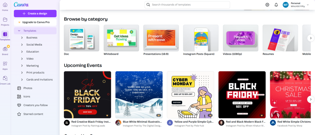
The free version of Canva is incredibly generous, but they also offer a paid subscription if you want access to premium photos, brand kits, and background removal tools. For most people, it feels like having a designer in your pocket.
2. Snappa: Fast, Clean, and Out of Your Way
If Canva starts to feel a bit too bloated or crowded with features, Snappa is a fantastic alternative. It’s built for absolute speed.
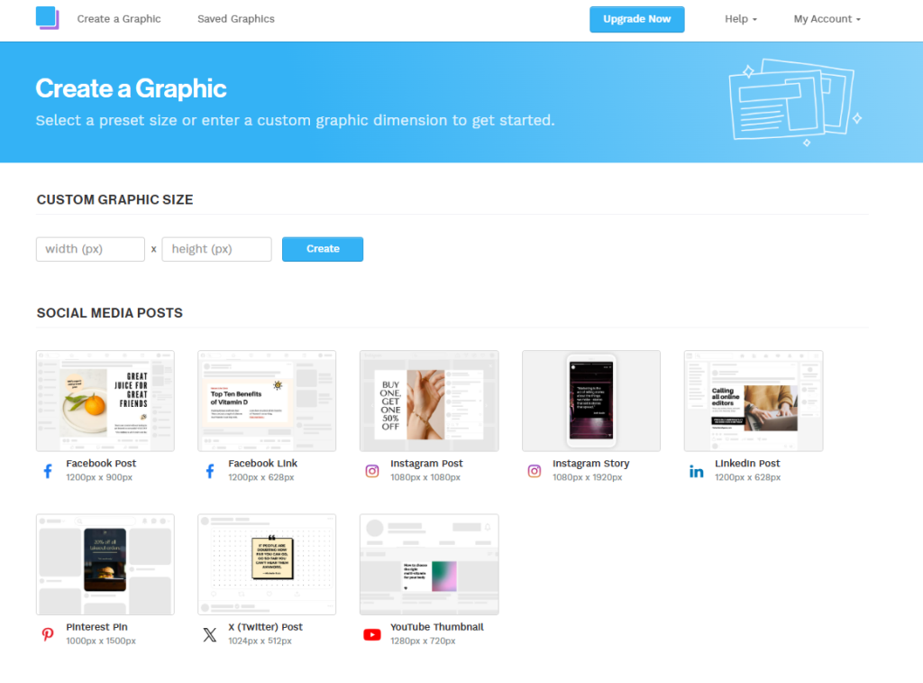
If you are churning out blog headers or quick banners week after week, you don’t want to dig through endless tabs of templates and elements. You just want a clean screen, which is exactly what Snappa gives you. It focuses on the essentials, which makes the entire editing process feel much faster. One of the coolest features is how it lets you resize a finished design for other platforms on the fly. You don’t have to rebuild the same graphic three times for Twitter, Facebook, and Instagram.
3. Visme: The Bridge Between Basic and Advanced
Visme occupies a weird, useful space right in between simple templates and heavy professional tools.
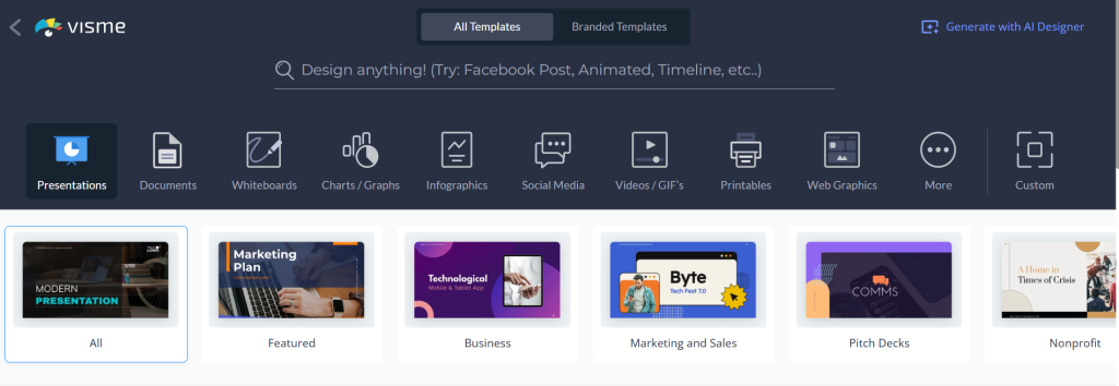
Visme is your go-to when you’re dealing with numbers, charts, or heavy presentations. Making an infographic look good from scratch is usually a nightmare, but Visme lets you turn messy data into something clean and actually readable. It has pre-built blocks for timelines, charts, and diagrams, making it easy to create reports that look like they came from a corporate design agency.
Which One Should You Actually Pick?
Which tool you should go with depends entirely on what you’re trying to build. Let’s make it simple so you don’t have to waste your entire afternoon testing them all out:
- If you’re focused on social media, Instagram stories, or flyer designs: Go with Canva. They have a template for pretty much every size and format under the sun, which means you never have to guess the correct dimensions.
- If you need to make blog headers, basic banners, or quick web banners over and over: Try Snappa. It loads instantly, keeps things dead simple, and cuts out any extra features that might get in your way.
- If you are building presentations, pitch decks, or visual reports with lots of charts: Use Visme. It’s set up to handle heavy business data in a way that actually looks interesting instead of sleep-inducing.
If you’re still not sure where to start, honestly, just open Canva first. It’s the easiest entry point for a beginner, and you can always move to one of the others later if you feel like you’ve outgrown it.
4 Easy Habits That Make Your Graphics Look Instant-Pro
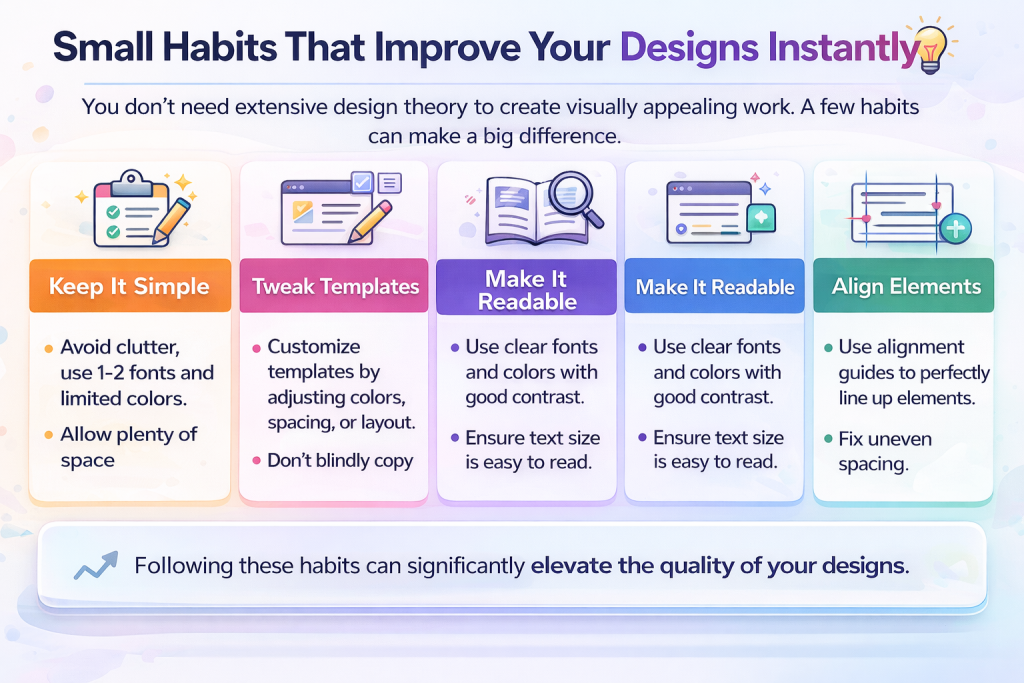
You don’t need to go to design school to make your graphics look significantly better. Just keep these four basic rules in mind:
1. Stop Adding Stuff
The classic beginner move is trying to cram every single font, sticker, and color onto one screen. This is how you end up with a graphic that looks like a Myspace page from 2005. Keep it minimal. Stick to one or two fonts at most, and use a simple color palette (two or three colors max). Let the design breathe. White space isn’t empty space—it’s the secret to making things look professional.
2. Don’t Fight the Template
Remember, templates are designed by people who actually know what they’re doing. They’ve already done the heavy lifting on spacing, alignment, and layout. When you pick a template, try to make minimal changes. Swap the text, update the colors to match your brand, and leave the structure alone. If you start dragging text boxes to random corners, you ruin the balance that made the template look good in the first place.
3. If You Can’t Read It, It’s Useless
A design can look cool, but if people struggle to read the message, it has failed. Avoid placing light text on a light background (or dark text on a dark background). Keep your fonts clean and simple—steer clear of fancy, hard-to-read scripts for body text. Contrast is key. If you’re putting text over a photo, use a dark overlay on the photo first to make the text pop.
4. Use the Alignment Lines
Nothing looks more amateur than text boxes that are slightly off-center. Modern design tools have built-in guides that show up as you drag elements. Use them. Aligning your edges makes your graphic look instantly cleaner and more organized.But not everyone needs that level. If your goal is to create clean, simple visuals for everyday use, beginner-friendly tools are more than enough.
Wrap Up
Look, the bottom line is that these tools exist to save your sanity. By taking care of the layouts, fonts, and colors, they let you focus on what you’re trying to say rather than how to say it visually.
Just aim for clarity and keep it clean. Don’t overthink it. Once you do it a few times, whipping up a decent graphic will just become another quick thing you check off your to-do list.

Leave a Comment