Most bad presentations share the same problem: the slides are doing all the talking. Bullet points crammed with text, dense data tables, walls of paragraph copy—and somewhere in front of all that, a person who’s basically reading the screen to the room. The audience tunes out within two minutes and spends the rest of the time checking their phone.
The fix isn’t a better template. It’s understanding what slides are actually for. Slides are visual support for what you’re saying out loud. They’re not a document. They’re not a handout. When you design them like a document, you force the audience to choose between reading and listening—and most people will read, which means they’ve stopped listening to you.
Here are the principles that make presentations actually work, and the tools that make applying them easier.
One Idea Per Slide
This is the single most useful rule in presentation design. Every slide should carry one clear idea—one claim, one data point, one visual. If you find yourself writing more than two lines of text on a slide, that’s usually a sign you’re trying to fit two or three ideas into one slide.
The mental model that helps: each slide is a billboard someone sees for about 10 to 30 seconds. Billboards don’t have paragraphs. They have a headline and maybe a visual. Your slides should work the same way. A short, specific headline that states the point. Visuals or data that support it. White space that lets the viewer process it.
When you break a complex idea into multiple single-idea slides, a couple of things happen. First, your talk gets a natural rhythm—the slides are keeping pace with what you’re saying. Second, you can control the flow of information by literally controlling when the next slide appears. Third, the audience can follow along without getting lost.
Text: Much Less Than You Think
The instinct is to put your full thought on the slide so people don’t miss anything. But the opposite is true—more text makes people read instead of listen, and they retain less of both. The research is pretty clear on this: people can’t simultaneously read and process spoken language, so when you give them slides full of text, you’re splitting their attention in half.
The practical rule: if a point can be said in a sentence, don’t put the whole sentence on the slide. Put three words that capture the essence. You say the rest out loud. The short phrase on screen acts as an anchor that helps people remember what you said, not a substitute for saying it.
For slide headlines, complete sentences often work better than noun phrases. “Sales dropped 23% in Q2” is more useful than “Q2 Sales Performance.” The headline that makes the point outright means the audience understands the message immediately, even if they glance at the slide for two seconds.
Visual Hierarchy: Guide the Eye
Visual hierarchy is how you control where someone looks first, second, and third on a slide. Without it, the eye wanders and nothing stands out. With it, you can make sure the most important thing on the slide gets seen immediately.
Guiding people’s eyes is simpler than it sounds:
- Size: bigger stuff gets seen first. Make your core point or key number giant so it’s impossible to miss.
- Contrast: bold text or a sharp color pops off the screen immediately. Use it sparingly so it actually means something when you do.
- Position: people naturally scan from the top-left down to the bottom-right. Put your main message right where eyes land first.
- Empty space: don’t be afraid of blank margins. Giving your text room to breathe makes it way easier to read. When you crowd every inch of the slide, people’s eyes just glaze over.
You don’t need to be a graphic designer to apply these. You just need to look at each slide and ask: what do I want someone to see first? Is that actually the most visually prominent element right now? If not, adjust until it is.
Color: Two or Three, Max
Slides that use eight different colors don’t look vibrant and engaging—they look chaotic. A tight color palette of two or three colors, consistently applied, does two things: it looks more professional and it gives you a way to use color meaningfully. When color signals “this is the important number” or “this is the data I want you to focus on,” it works. When every element is a different color, color means nothing.
Pick a background (usually white or very light gray), a primary color for headlines and key emphasis, and a secondary accent for supporting elements. Stick to those three throughout the whole deck. If someone else’s brand colors are involved, use those as your palette anchors.
For data charts and graphs, use color to highlight the specific data point you’re making the claim about. Gray everything else. If you’re showing a bar chart comparing five regions and one region is the point of your slide, make that bar your primary color and make the other four gray. The audience immediately understands what matters.
Fonts: One Family, Two Weights
The same logic applies to typography. One font family—usually a sans-serif because it reads more clearly on screen at any size—used in two weights (regular and bold) is all you need. Adding three or four different fonts makes a slide look like a ransom note.
Sans-serif fonts like Inter, Helvetica, or Open Sans work well for screen. Avoid decorative or script fonts entirely for body text—they’re hard to read at speed. Use your bold weight for headlines and key numbers, regular weight for supporting text, and keep a consistent size hierarchy (headline bigger than subheading, subheading bigger than body).
Font size matters more than people think. A font that reads fine on your laptop screen may be invisible to someone in the back row. For in-person presentations projected onto a screen, nothing below 24pt should appear on a slide. For text you want people to actually read quickly, 28–36pt is safer.
Tools That Make This Easier
Canva — Best for Non-Designers Who Want Professional Results Fast
Canva has a presentation builder with hundreds of templates that already apply good visual hierarchy, consistent color palettes, and appropriate font pairings. You’re not starting from a blank slide—you’re editing a design that already works. That head start is significant if design isn’t your background.
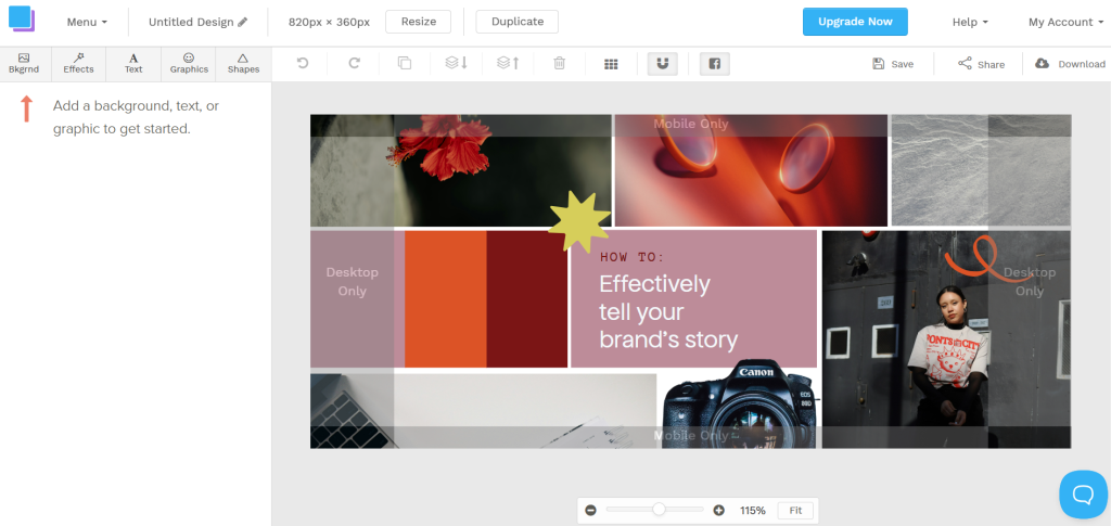
The real advantage for presentations specifically is the brand kit feature on paid plans. You set your brand colors, fonts, and logo once, and every template automatically applies them. Teams building presentations frequently—pitch decks, client updates, internal reviews—don’t have to rebuild brand consistency from scratch every time.
Canva exports to PDF for sharing and to video format if you want a self-running presentation. The web-based editor means anyone on the team can collaborate in the same file without installing anything.
Beautiful.ai — Best for Hands-Off Smart Layouts
Beautiful works a bit differently: it uses smart templates that automatically reposition everything whenever you type. If you add an extra bullet point or swap in a picture, the slide snaps itself into place so you never have to nudge boxes around to fix broken spacing.

Here’s the honest catch: you give up free-form tweaking. You have to play inside their layout rules instead of dragging elements wherever you want. But if you hate messing with alignment and just want clean slides without thinking about it, that guardrail is actually a massive plus.
AhaSlides — Best for Interactive Presentations and Live Audience Engagement
AhaSlides is the tool for when your presentation needs to be a two-way experience rather than a broadcast. You can embed live polls, quizzes, word clouds, and Q&A directly into your slide deck. Audience members participate from their phones without downloading anything—just a code to enter in their browser.
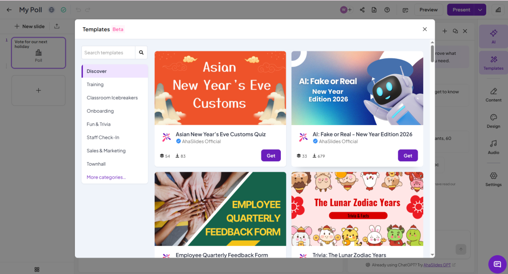
According to Duarte’s research on presentation effectiveness, audiences retain significantly more information when they’re actively participating rather than passively watching. AhaSlides builds that participation directly into the slide flow. For training sessions, team meetings, workshops, and any presentation where you want to check understanding or gather real-time input, it changes the dynamic completely.
The slides themselves are reasonably straightforward—clean templates, standard layout options. The value is the interaction layer, not the design sophistication.
Keynote — Best for Mac Users Who Want Professional Polish
Keynote is Apple’s presentation app, free for all Mac and iOS users, and its default templates and animation quality are noticeably better than what you get from most alternatives. The Magic Move transition—which animates objects from one slide position to the next—produces smooth, professional-looking transitions that take five seconds to apply and look like they required design expertise.

Keynote’s export to PowerPoint format is reliable enough that slides built in Keynote and opened in PowerPoint look close to identical, which matters when you’re presenting from someone else’s Windows laptop at the last minute.
The limitation is the Apple ecosystem dependency. Collaboration with non-Mac users gets awkward, and there’s no meaningful browser-based version for real-time co-editing the way Google Slides or Canva handle.
The Content Structure That Works
According to Nielsen Norman Group’s research on slide readability, cognitive load—how hard a slide is to process—directly impacts how much the audience retains. Simpler slides aren’t dumbed down; they’re optimized for how the brain actually processes visual information.
A structure that consistently works for business presentations:
- The hook: one opening slide that nails the core problem right away. Skip the boring table-of-contents slide and tell people why they should care right now.
- The middle: the actual meat, broken into bite-sized slides. One takeaway per slide. If you’re showing a chart, write the takeaway as the title instead of a generic label like “Q2 Metrics.”
- The wrap-up: one final slide with your exact recommendation or next steps. Tell people plainly what to do next so the meeting doesn’t end with awkward silence.
Whatever your content, that three-part arc—problem, evidence, answer—is what lets an audience follow you without getting lost.
Conclusion
Good presentation design comes down to a few disciplined habits: one idea per slide, minimal text, clear visual hierarchy, a tight color palette, and a consistent font system. None of it requires design talent. It requires restraint—and the willingness to take content off slides rather than always adding more.
Pick a tool that matches your workflow and skill level, apply these principles from the start rather than at the end, and your presentations will feel noticeably different to the people sitting through them.



Leave a Comment